Sunday, July 5, 2026
Fifth Roll of Polyfilm Handmade Film from Ukraine
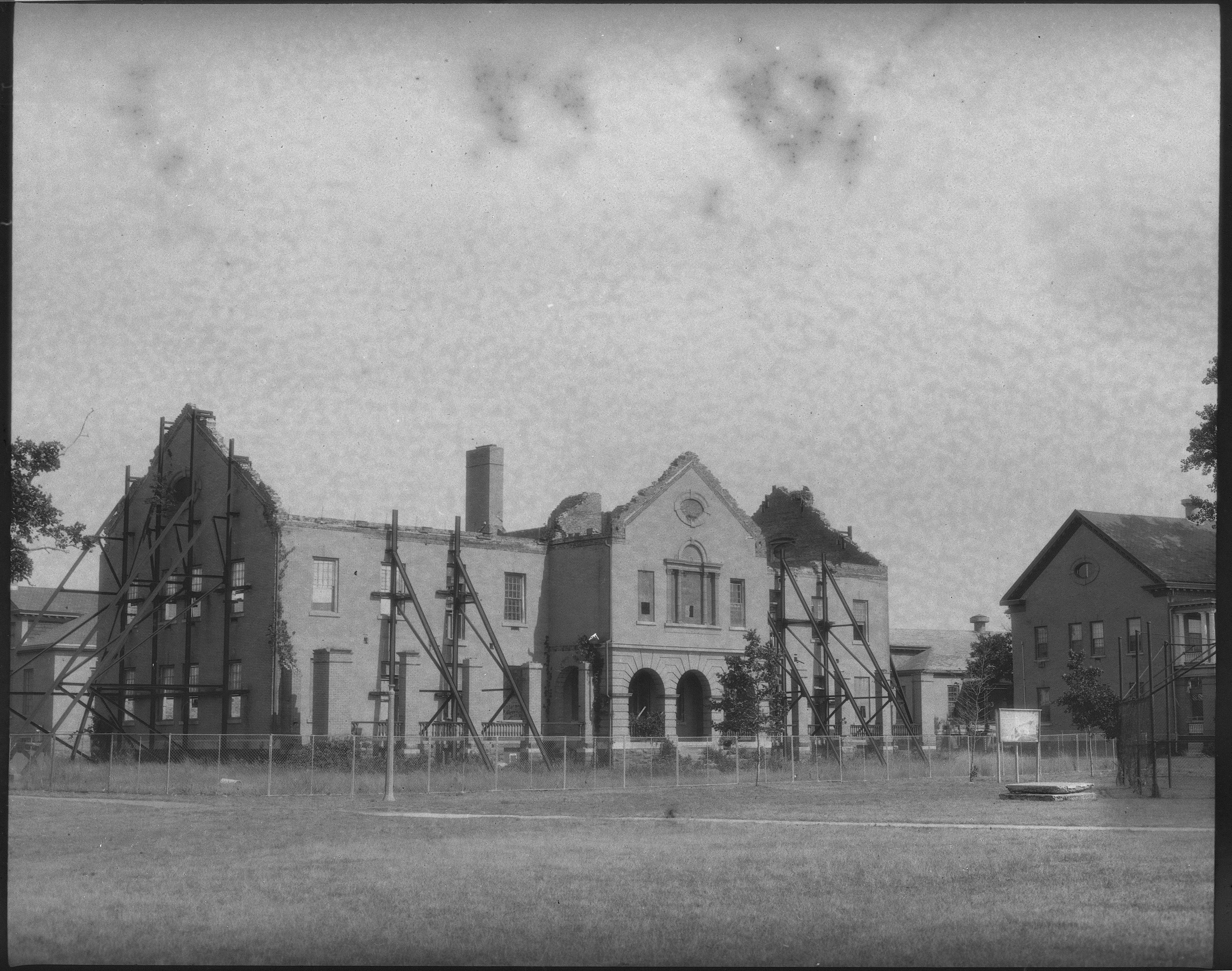
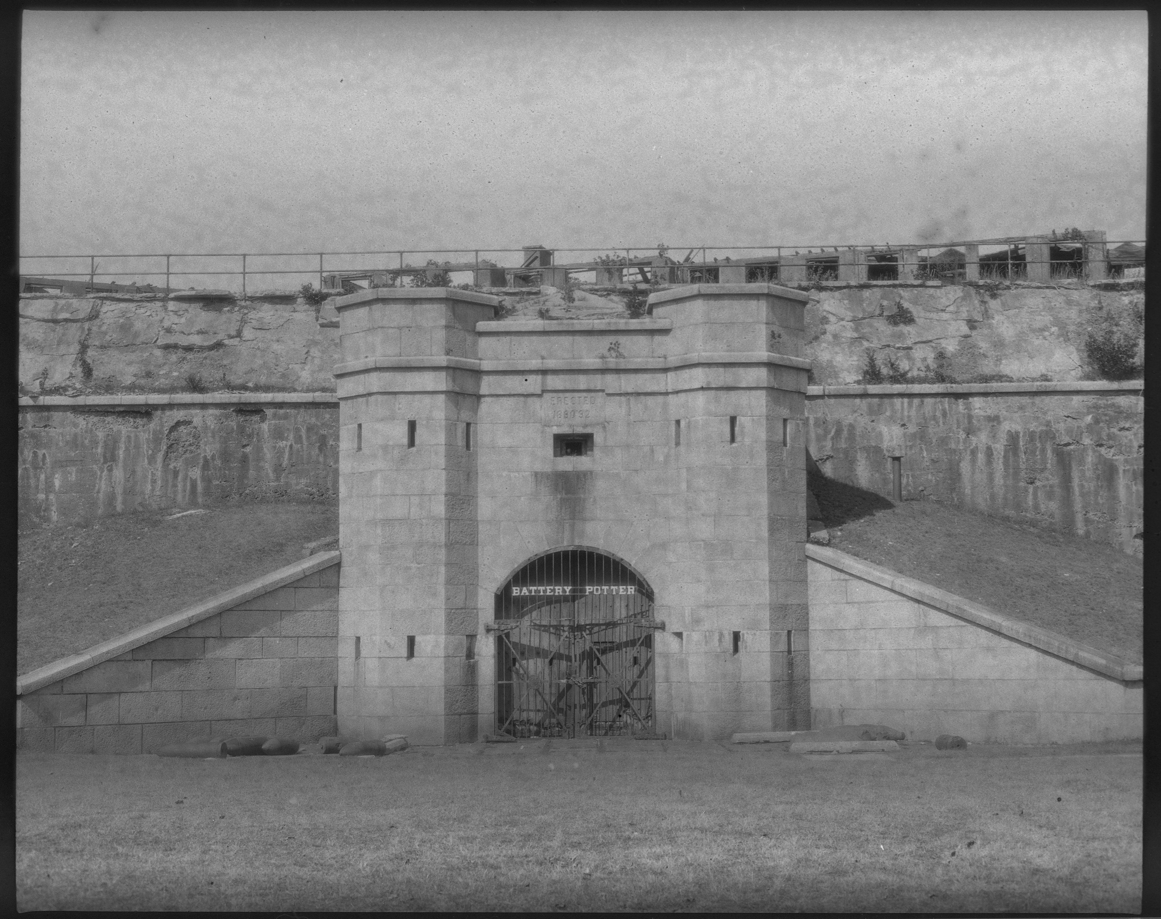
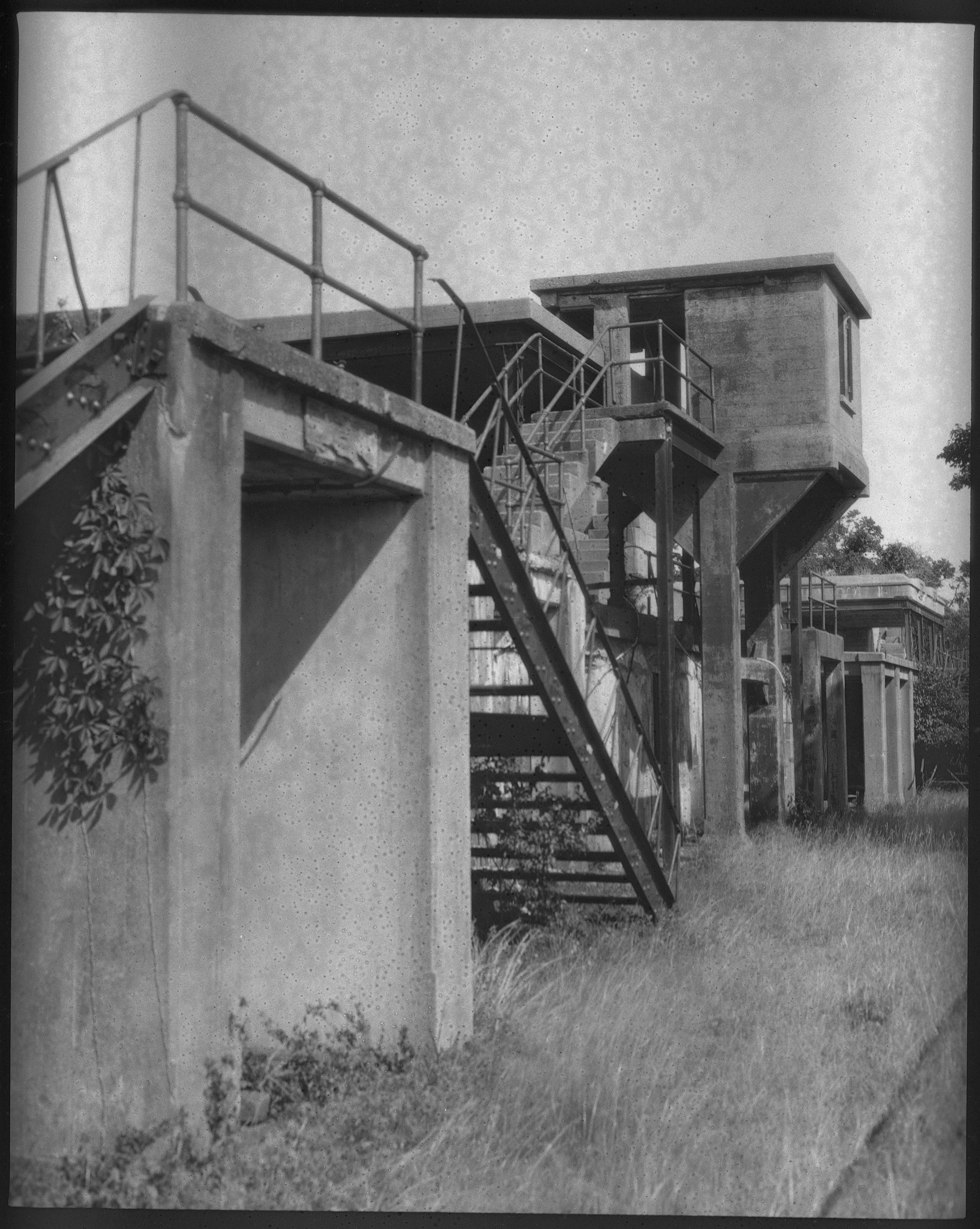
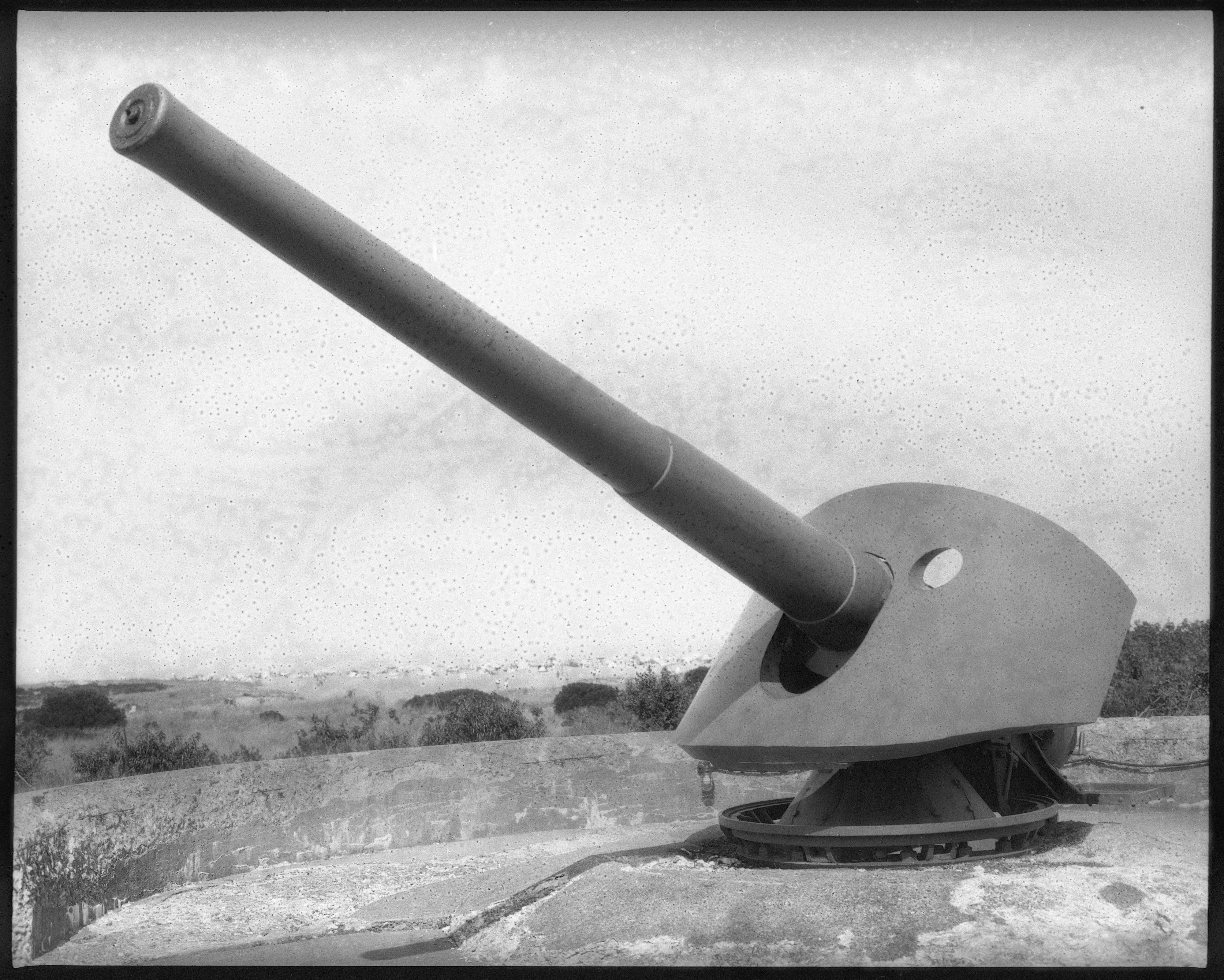
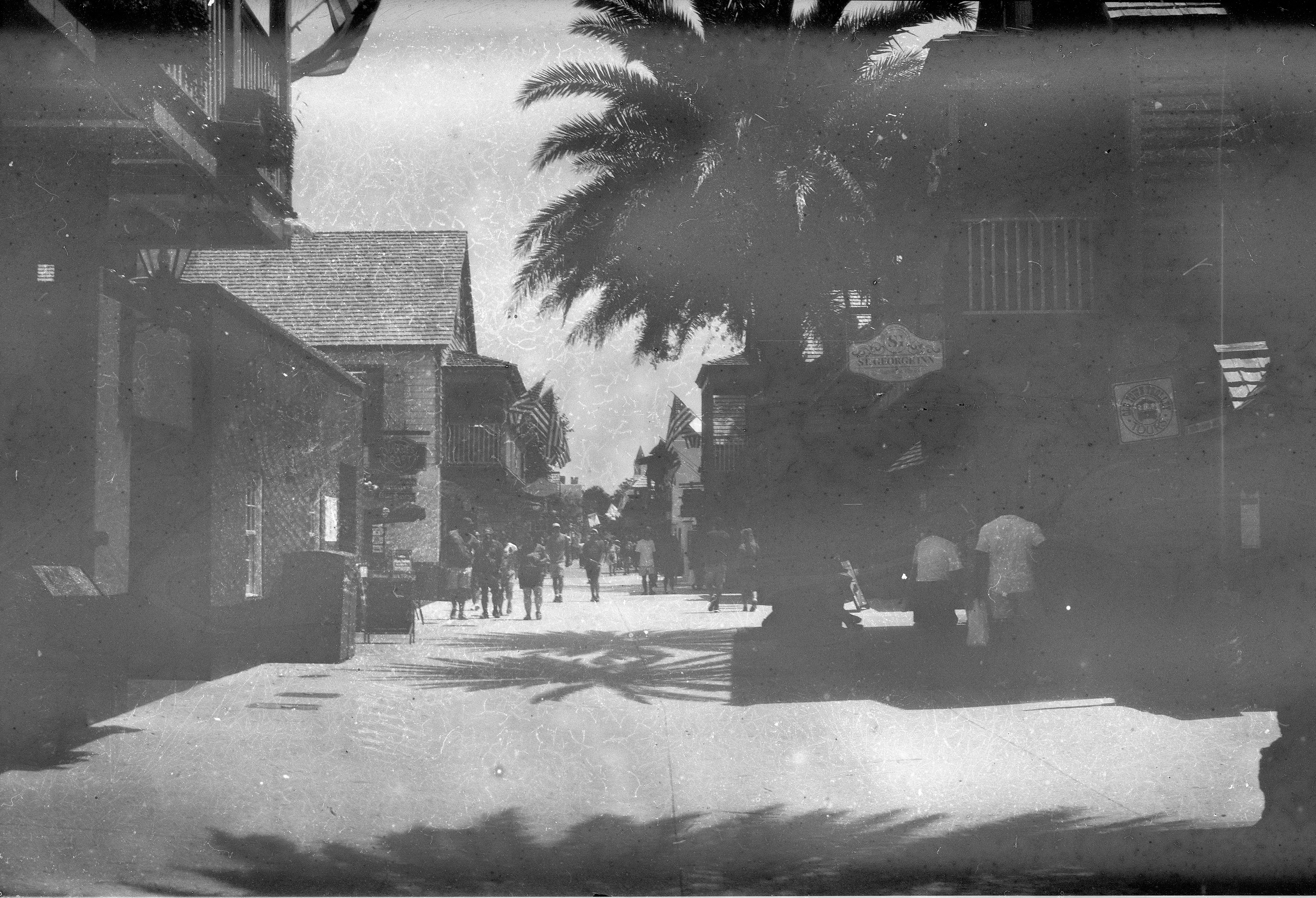
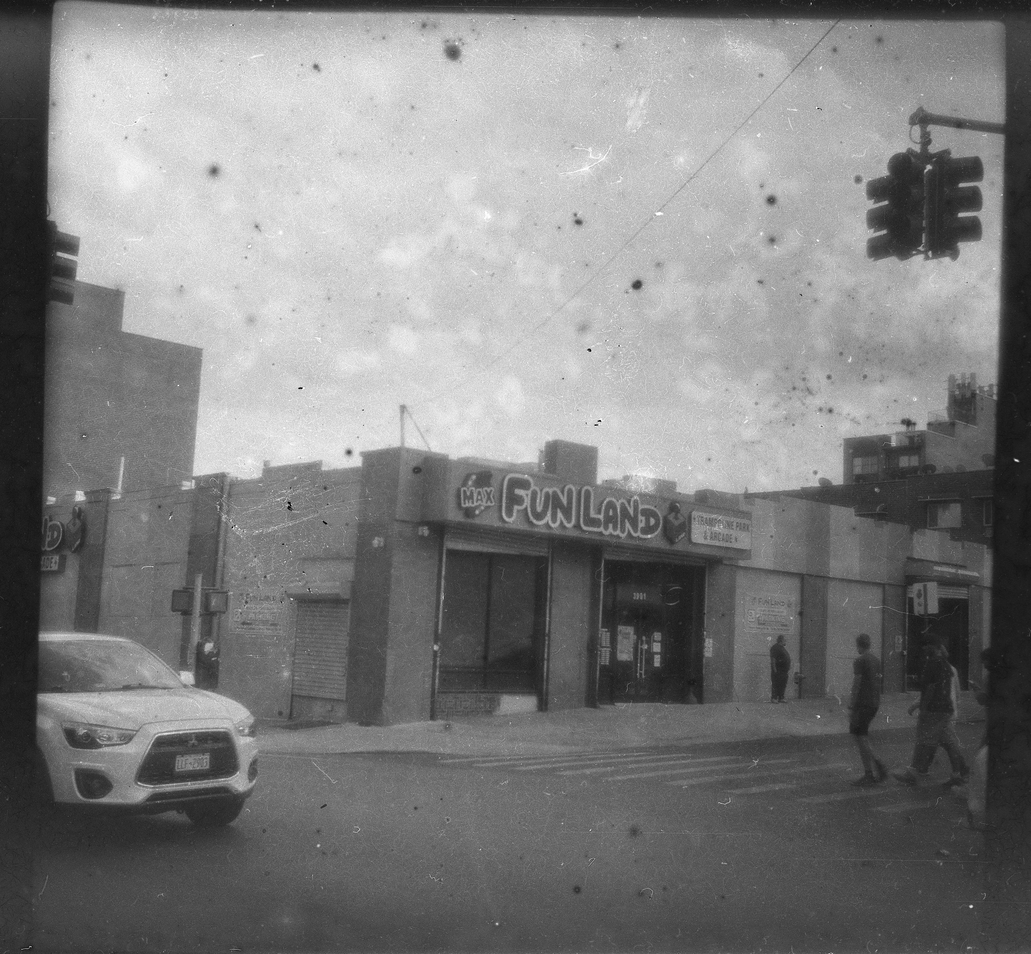
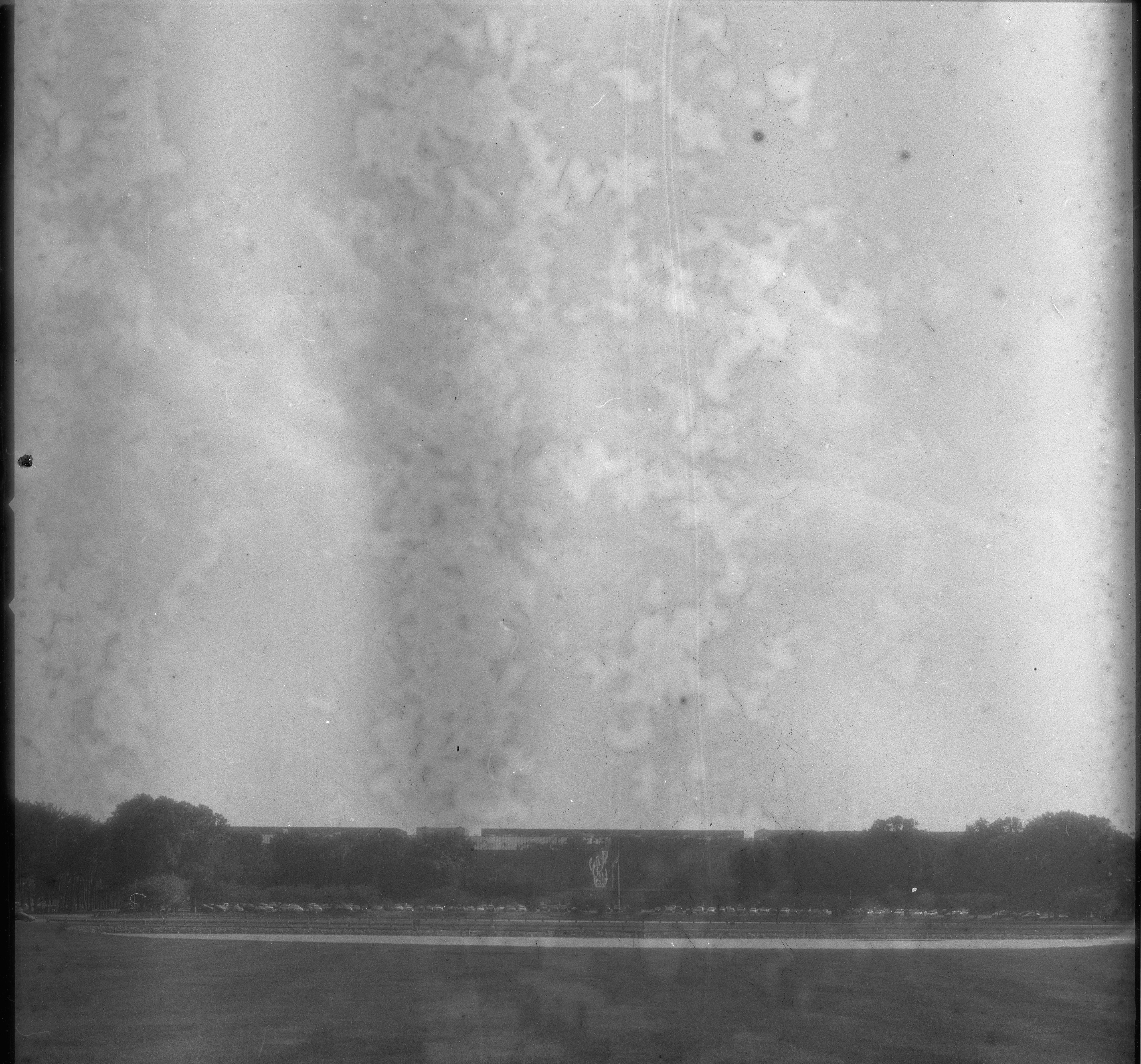
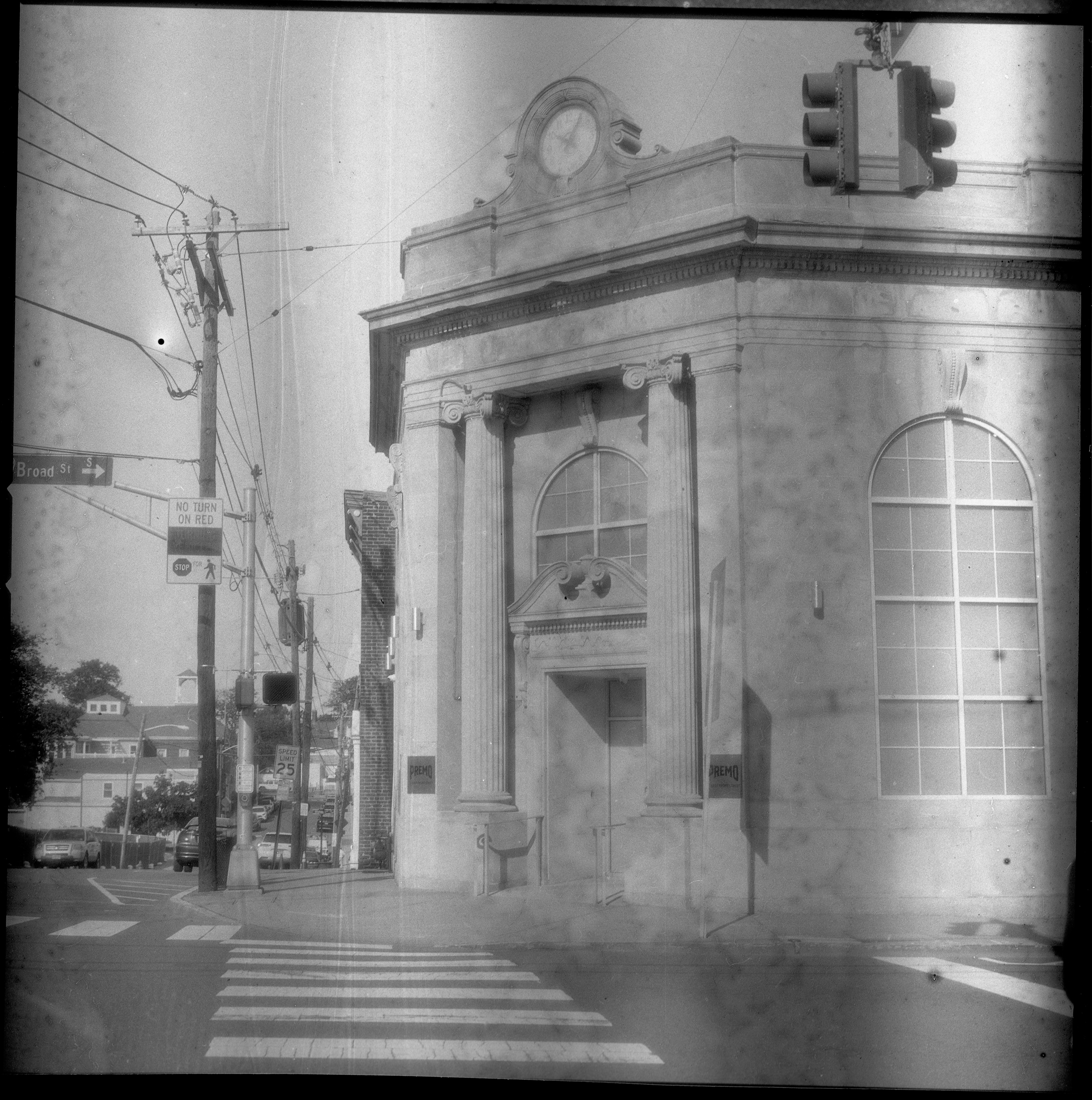
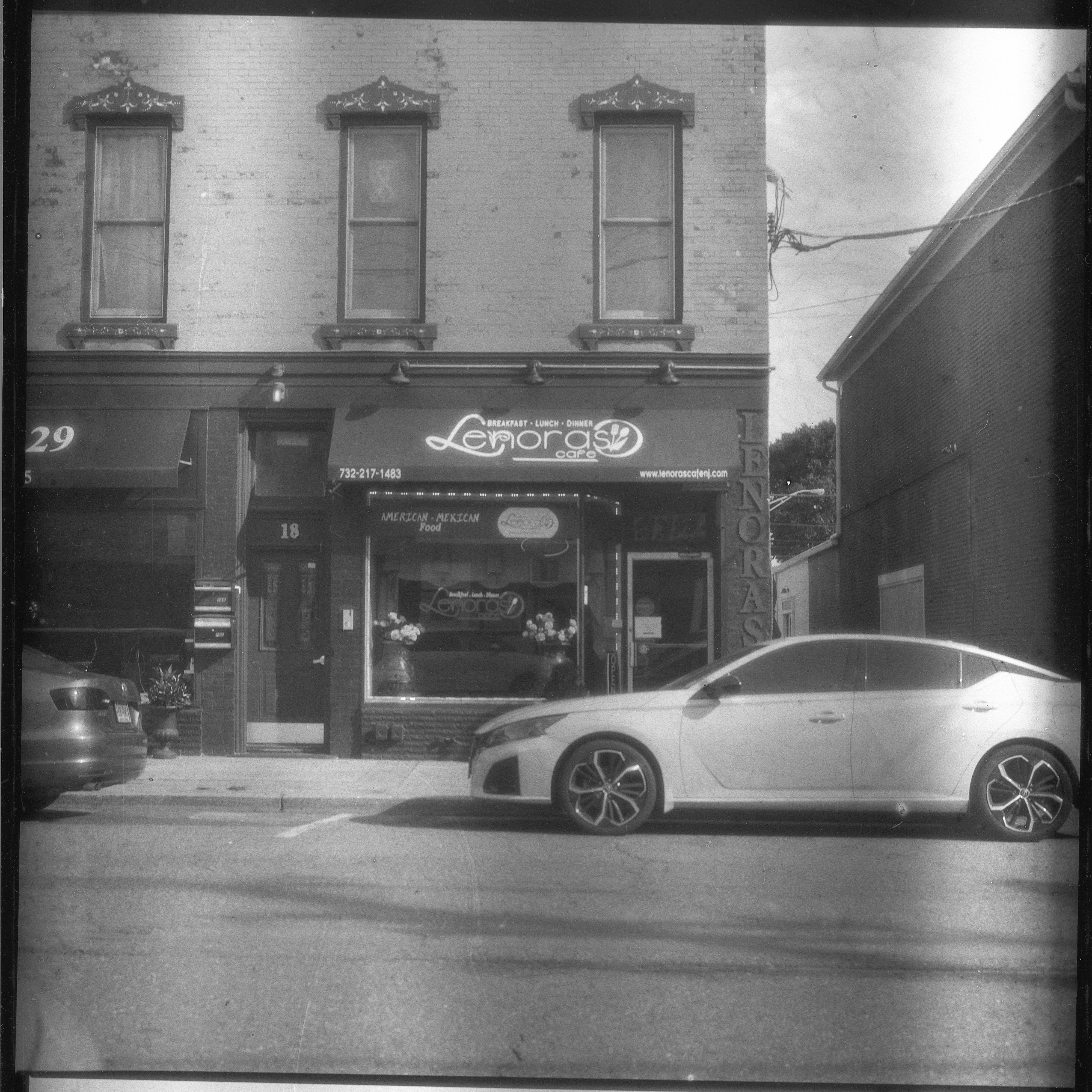
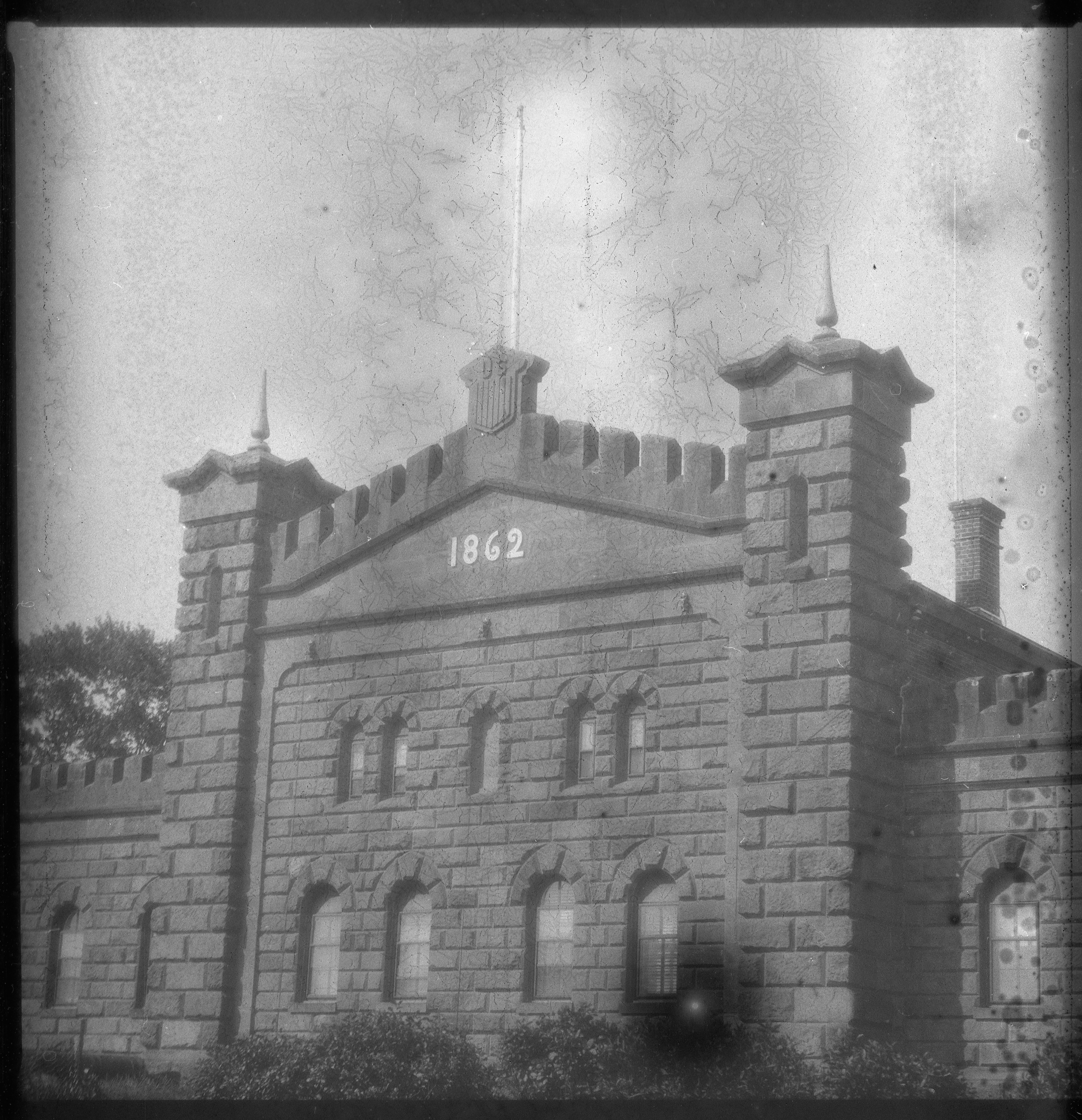
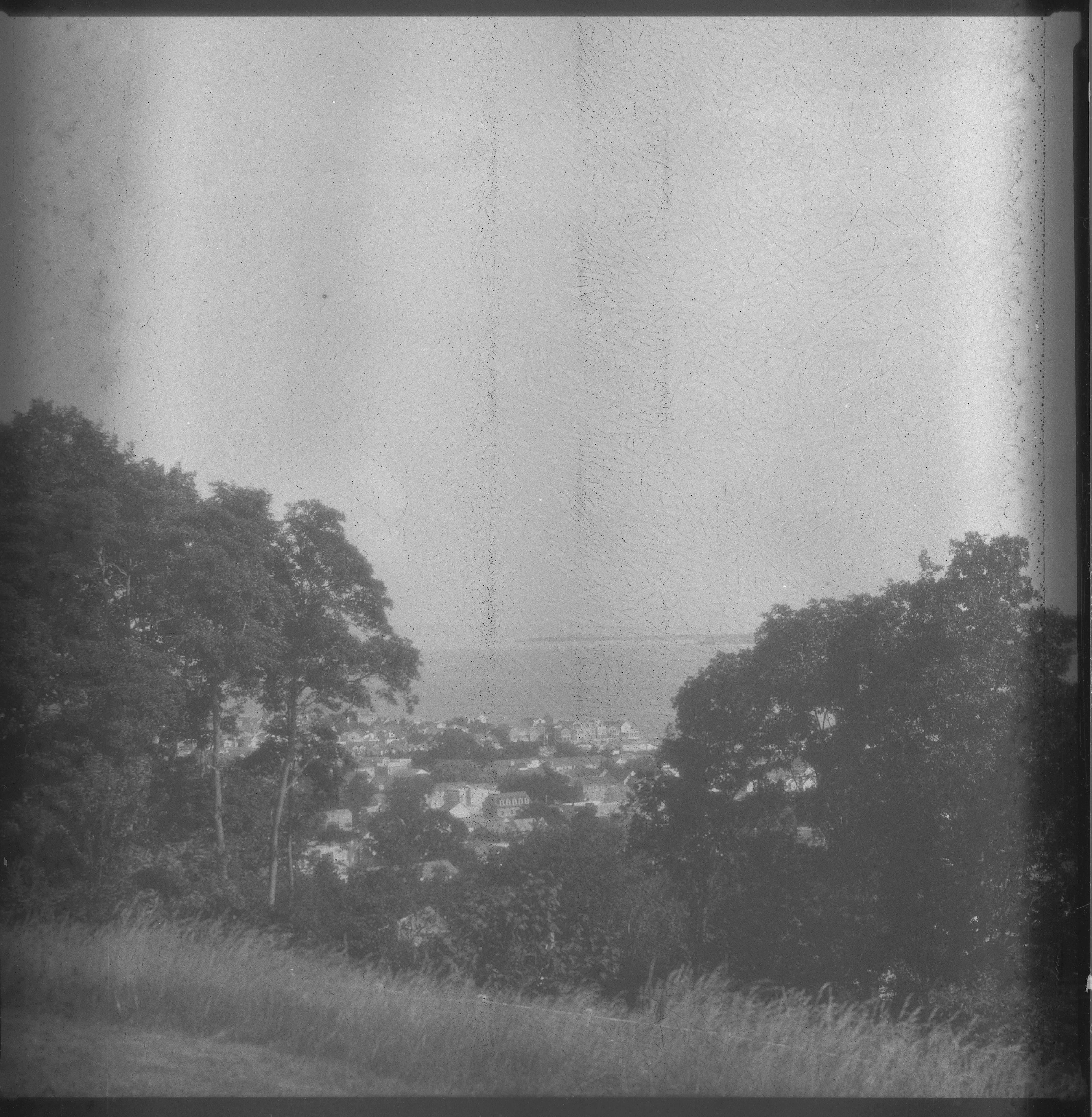
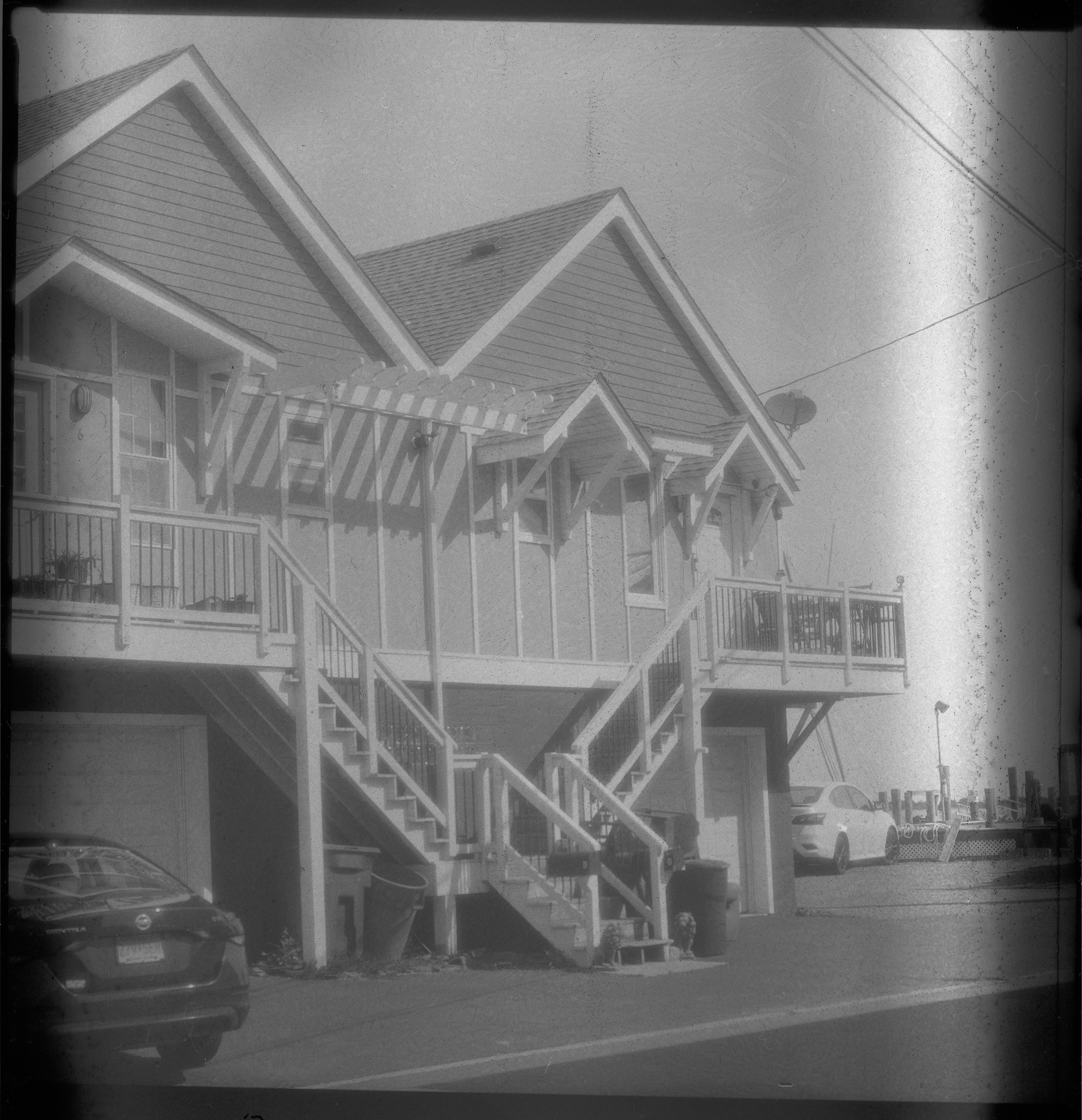
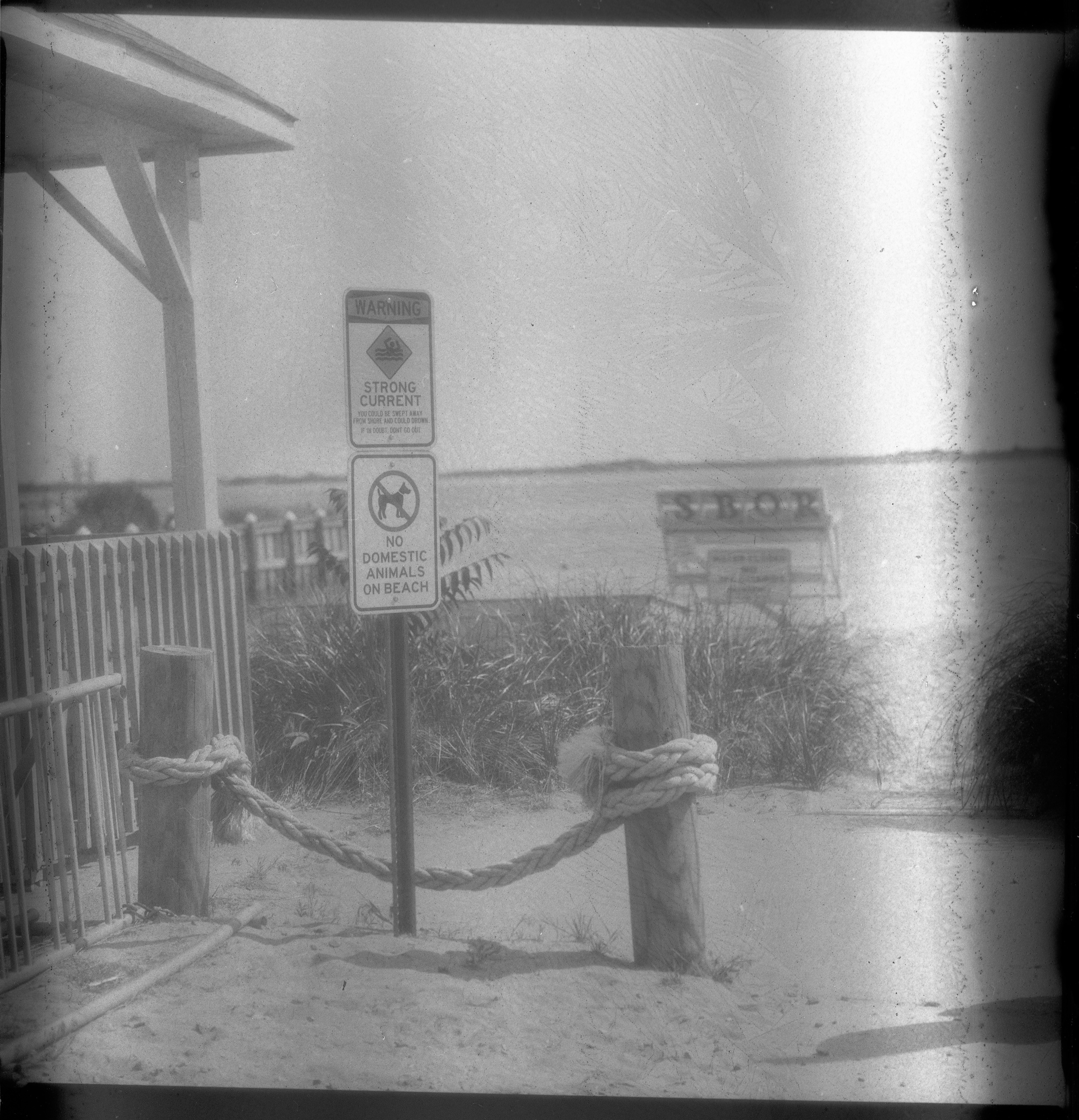
As I mentioned in my previous post, I got a couple of rolls of film from a batch, 160626, that is supposed to address the issues I found in my previous four rolls from batch 260526. I did indeed take it out into the inferno of New Jersey this afternoon, temperatures in the low 100s Fahrenheit, pushing 40 Celsius (I did see temps go above 40C/104F today, but not while or where I was shooting). I loaded a roll in my Pentax 67 and took it to Fort Hancock on Sandy Hook, figuring that photos of its defensive fortifications would be an appropriate thing to shoot on Ukrainian film. I also hoped it would be slightly less hot, which it was, but only by a degree or two.
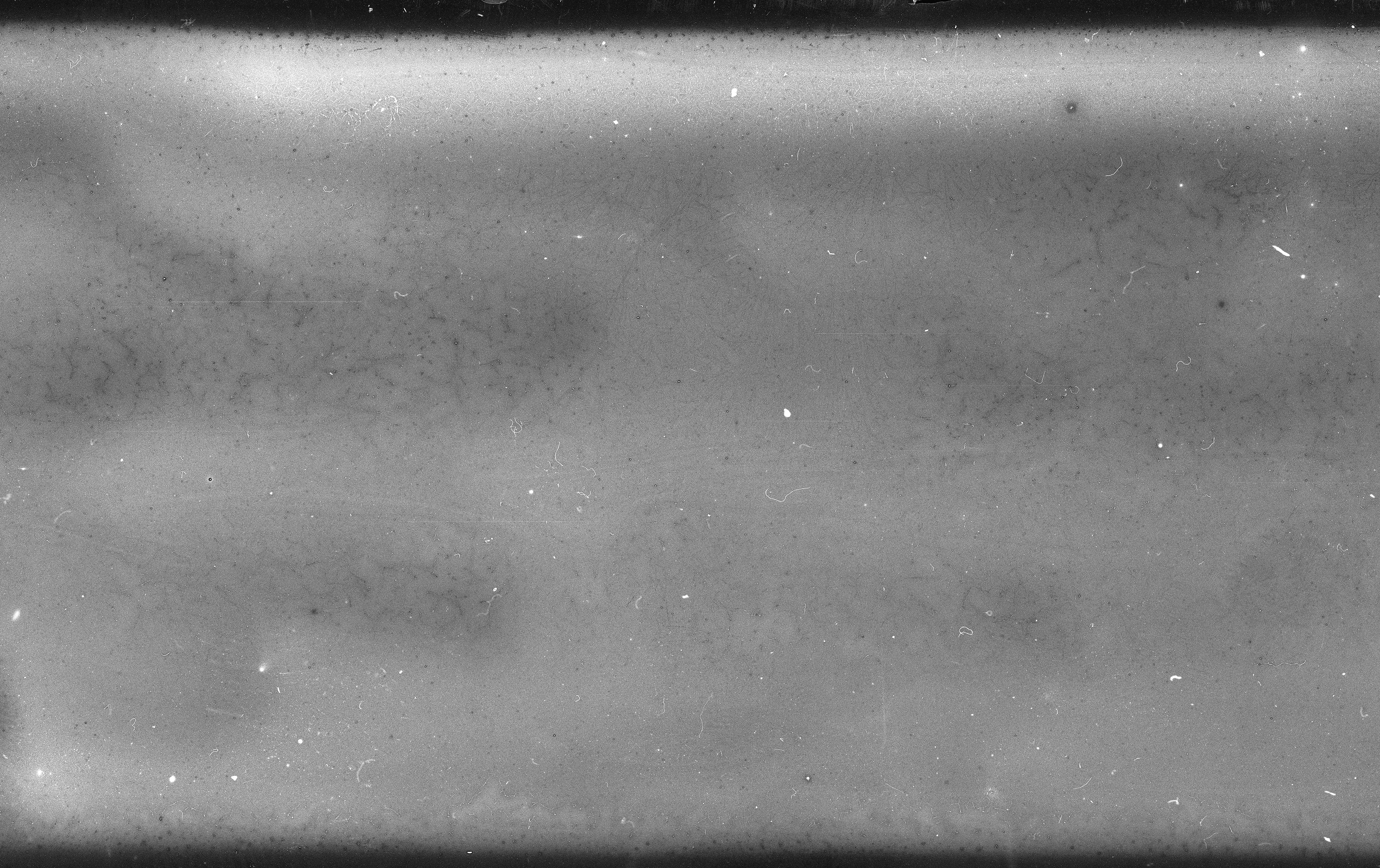
The first four photos show mottling. It's not clear to me if this is interaction with the paper, or a more subtle instance of the plasticizers showing their presence. It's really obvious in the skies of these photos.
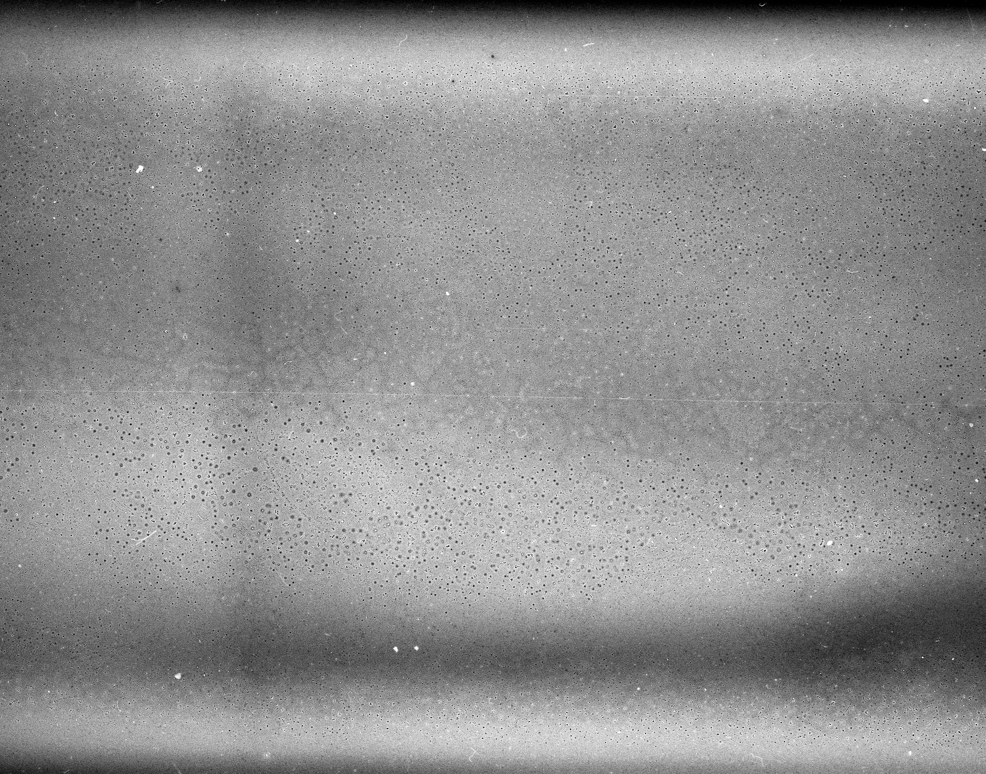
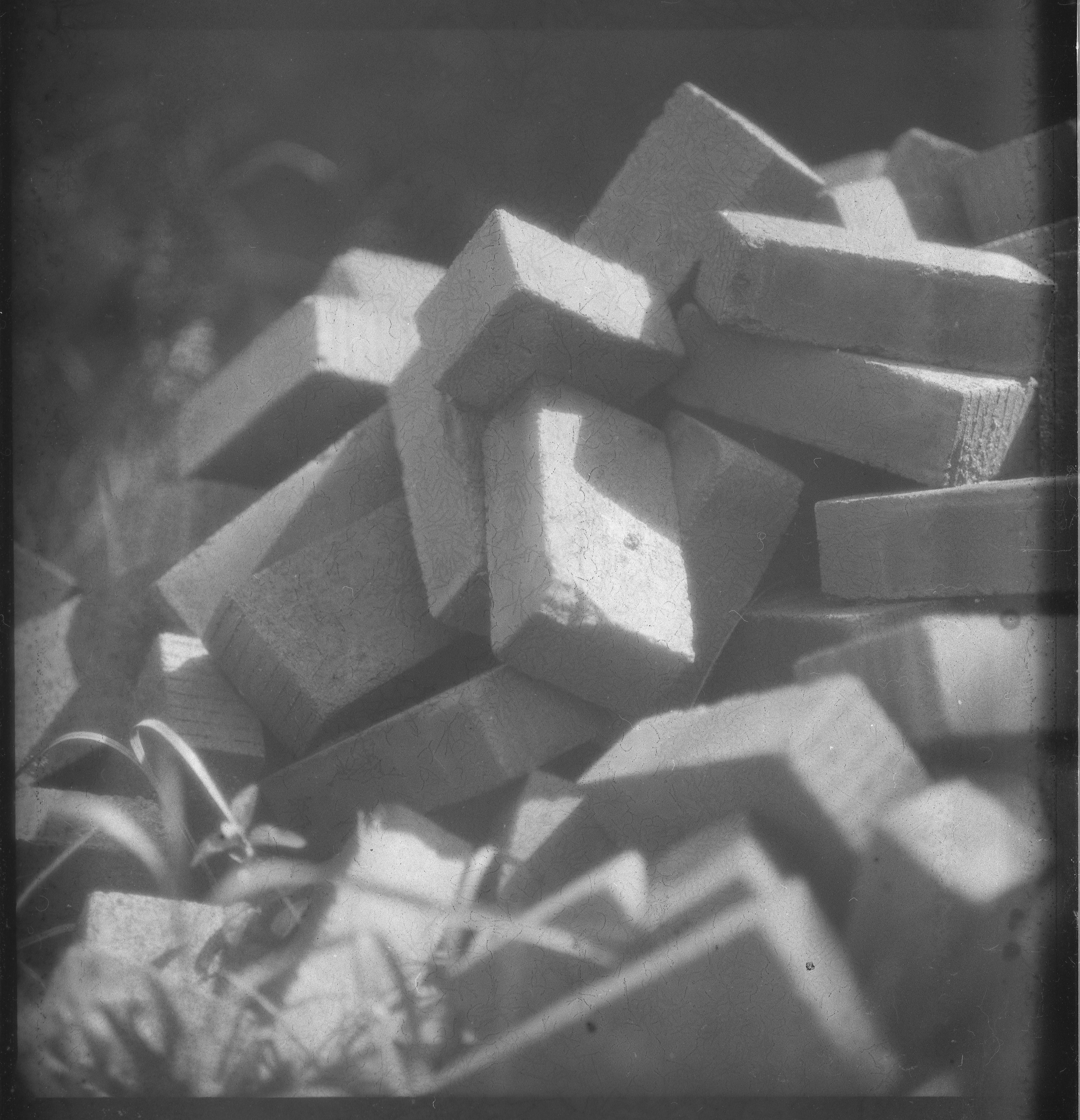
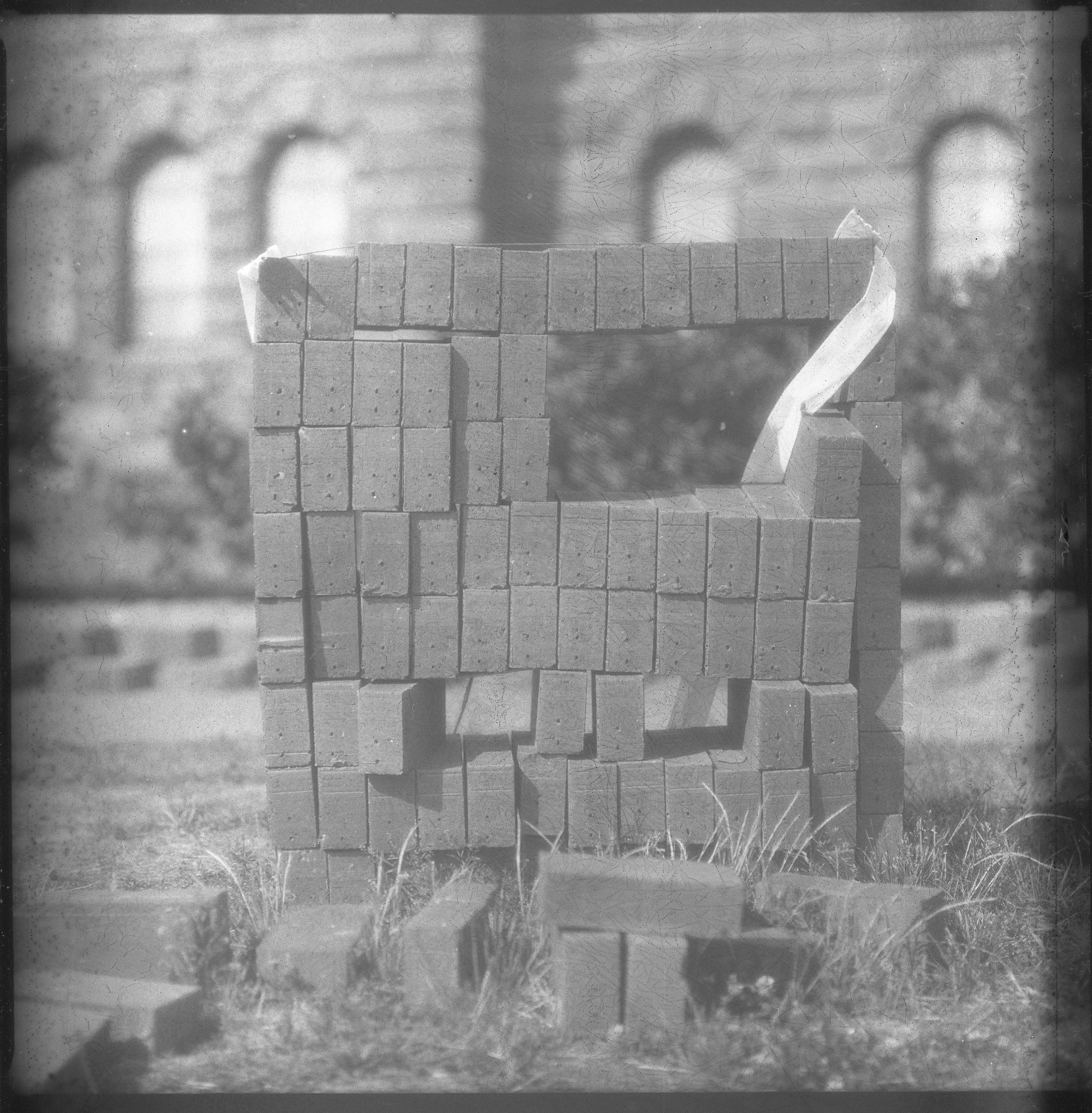
The fifth, sixth, and seventh photos show evidence of another fault, with collections of black dots present in mostly the sky. Seven has the most incidence of this.
I got another blank shot on this roll. The Pentax 67 does something weird when the speed dial is moved accidentally to a place between two settings where it kind of implies that it opened the shutter, definitely brings the mirror up, but doesn't expose anything. It's interesting to compare this with the blank shot in the previous roll. The black dots noted in the previous shots are here in spades.
Shots nine and ten also suffer from extensive dotting. Ten also ran into the end of the roll because I slightly misaligned the film at the beginning and hoped there was enough extra emulsion to cover the half inch difference between the arrow that says 120 inside the camera and the line that's supposed to line up with it. Oops. Missed it by that much. Kind of an interesting look.
It's hard for me to say if this fully addressed the issues with batch 260526; the mottling and the black dots both look to me like they could still come from the plasticizer, or it could be something else. This batch is a definitely improvement from the previous one. Temperatures are supposed to be in the upper 70s and lower 80s Fahrenheit, upper 20s Celsius, tomorrow. If I don't get out tomorrow with a roll in more temperate conditions, I'll try later in the week. Today was definitely a stress test, and I'd like to see what the film does a little farther from the edges of the weather.
Posted at 2:10 AM
Link to this entry
Thursday, July 2, 2026
Fourth Roll of Polyfilm Handmade Film from Ukraine
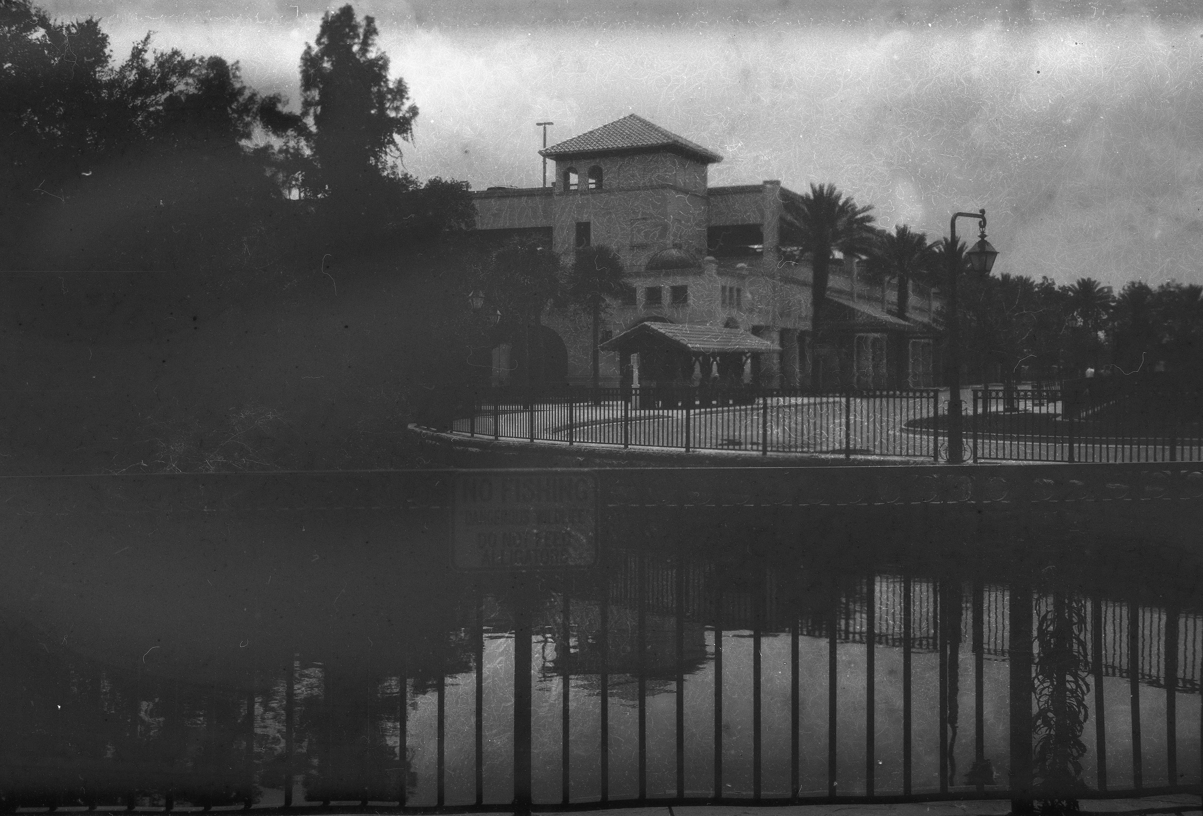
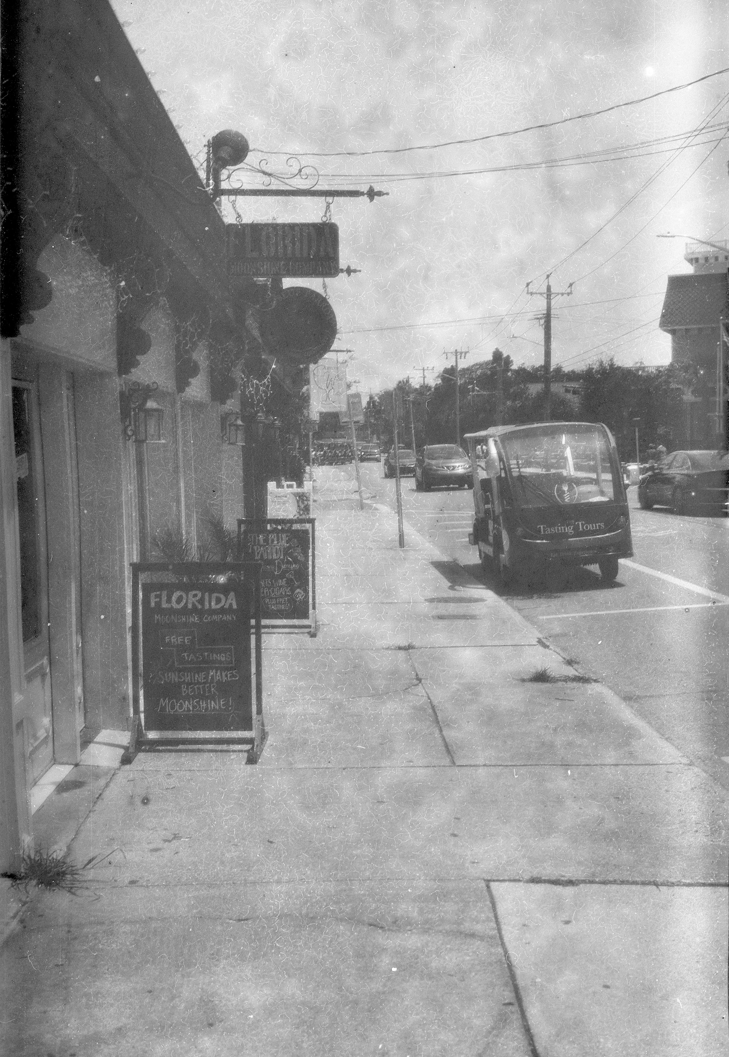
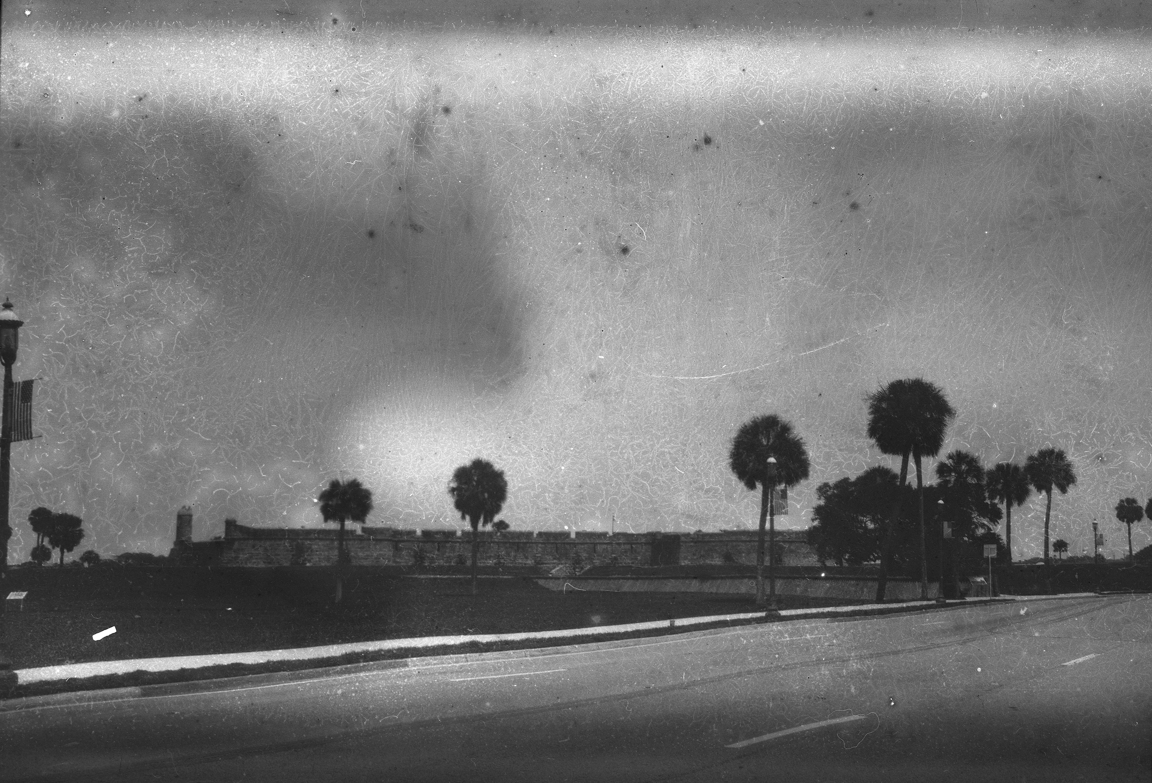
I had ordered four rolls in all of Ihor's homemade film. By roll 4, I knew what to expect (see the previous three blog posts) in the way of faults. I took my last roll on a trip to St. Augustine, Florida, anyway. It turned out to be an interesting test of the effect of heat on the rolls of batch 260526. Florida in late June is not cool; temperatures were pushing 100F/40C most days. I rerolled this roll onto a 620 spool and put it through my Kodak Medalist II. Developed in Rodinal 1:25 for 10 minutes, per Ihor's suggestion, after exposing at EI 50. Five minutes of pre-wash, acid stop bath, five minutes of post fixing wash. The heat had had its way with the film; the artifacts I had seen on the previous rolls were kind of pushed to 11.
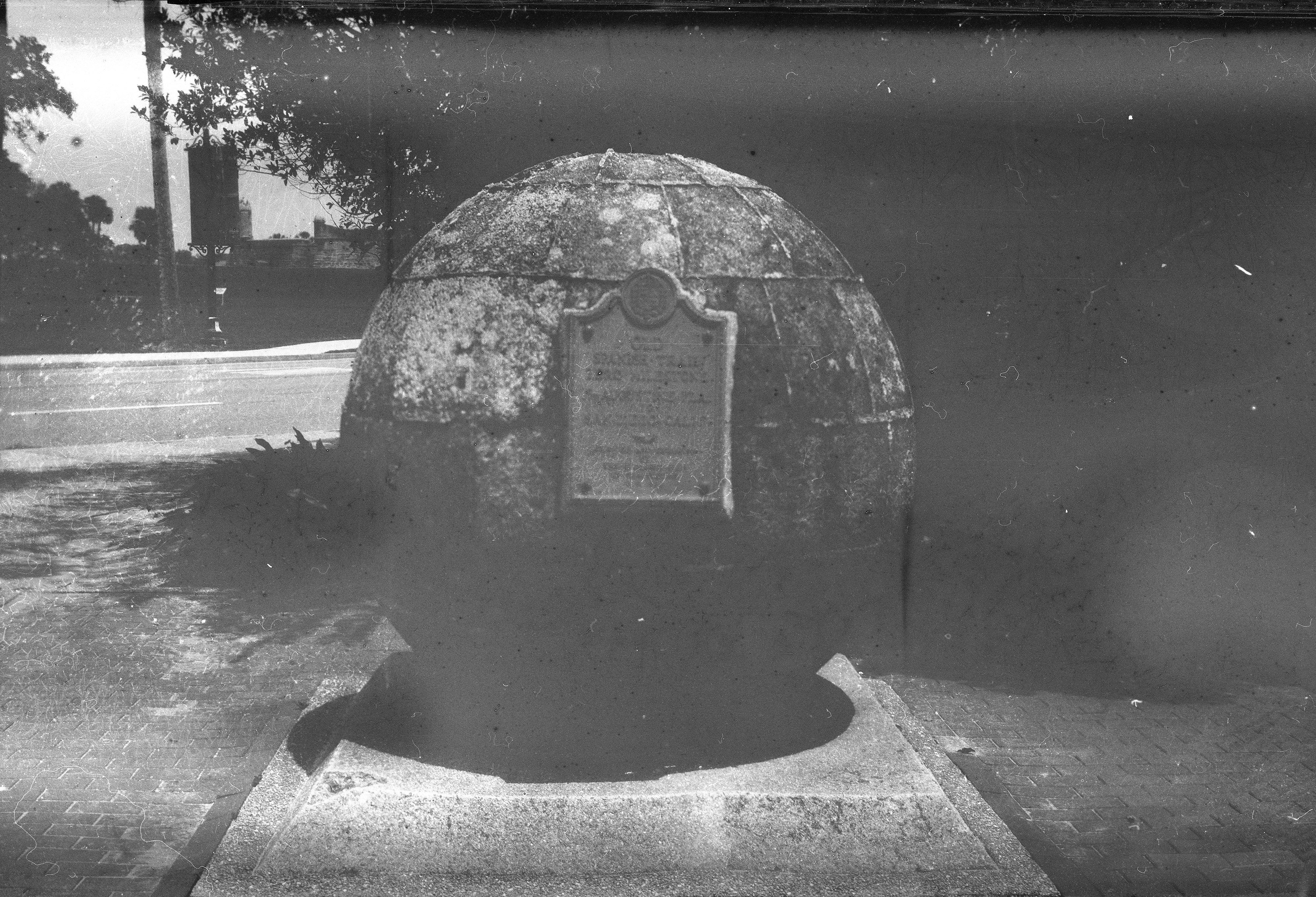
The seventh shot for some reason wasn't exposed. Not sure what happened here. But it makes for a pure look at the artifacts this batch encountered.
Ihor sent me a couple more rolls of his film in appreciation for my detailed feedback on batch 260526 that had exposed unexpected issues in his film. The new batch, 160626, should address the issues I found, and was shipped in an envelope that should have protected it from the heat of shipping somewhat. The weather here in New Jersey is now matching what we had in Florida last week; I saw the temperature hit 104F/40C yesterday afternoon. I may take one roll out in the heat to really stress test it and save the other for when it cools down after the long weekend.
Posted at 1:12 PM
Link to this entry
Tuesday, June 23, 2026
Third Roll of Polyfilm Handmade Film from Ukraine
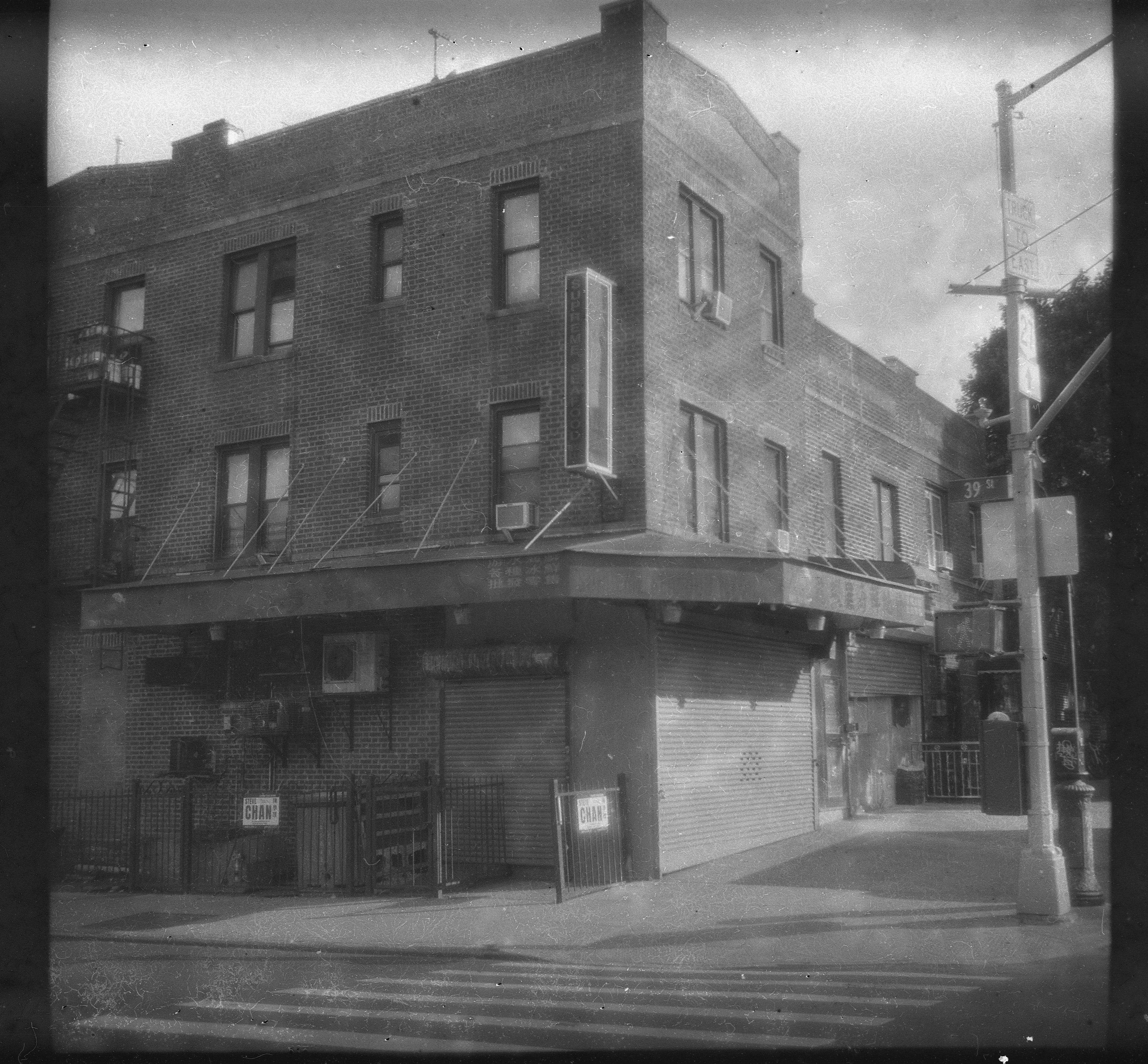
Shot my third roll of Polyfilm Ortho this past weekend when we were in Brooklyn. I didn't hold off until the Mermaid Parade; I shot it around Sunset Park the day before when we were walking around. Shot in my Zeiss Ikon Nettar 517/16, the smallest decent medium format camera I have. Per Ihor's suggestion, I shot it at EI 32, and developed in Rodinal 1:25 for 8 minutes. Six minutes of pre-soak, acid stop bath, 5 minutes of post fixer washing, and a final rinse in distilled water and Photo-Flo. I don't think it helped much; I think this batch just has issues.
The first couple of shots seem to have some kind of fog at the edges. I haven't seen this with other rolls of film I've put through the camera.
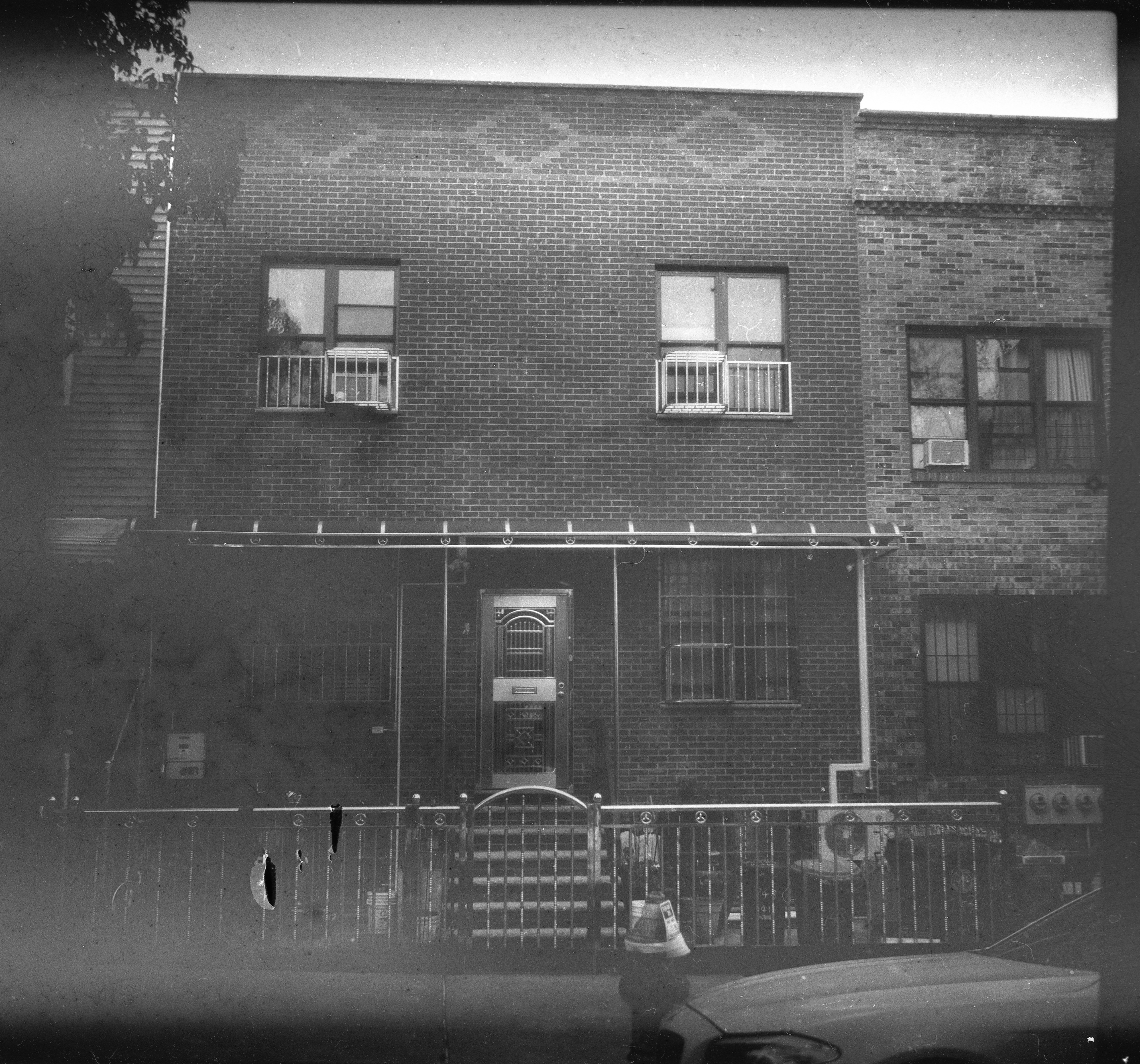
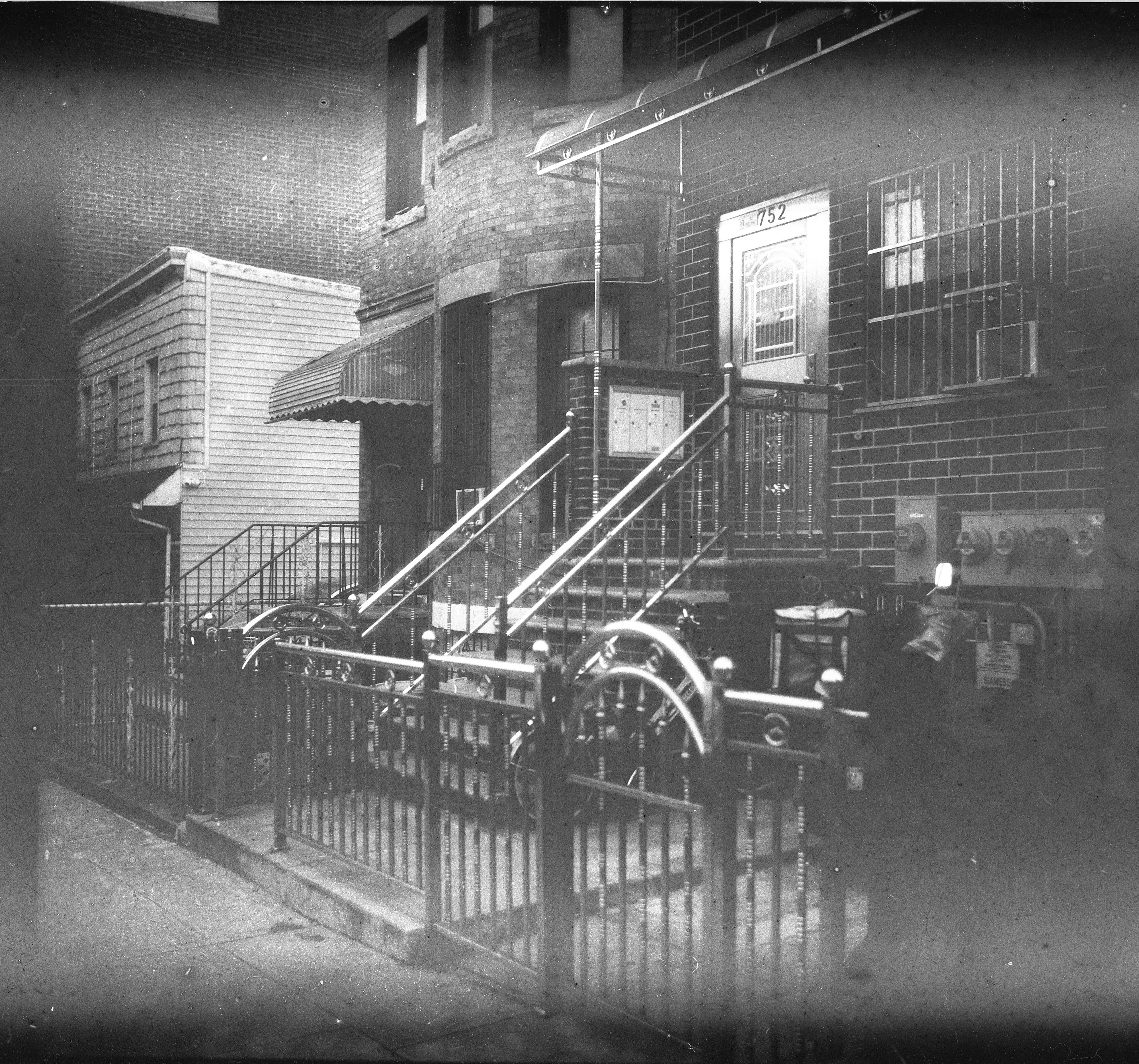
The third shot starts to show the plasticizer effect, particularly in the sky but also on the brick wall. It gets worse with the fourth shot, particularly in the bricks at top.
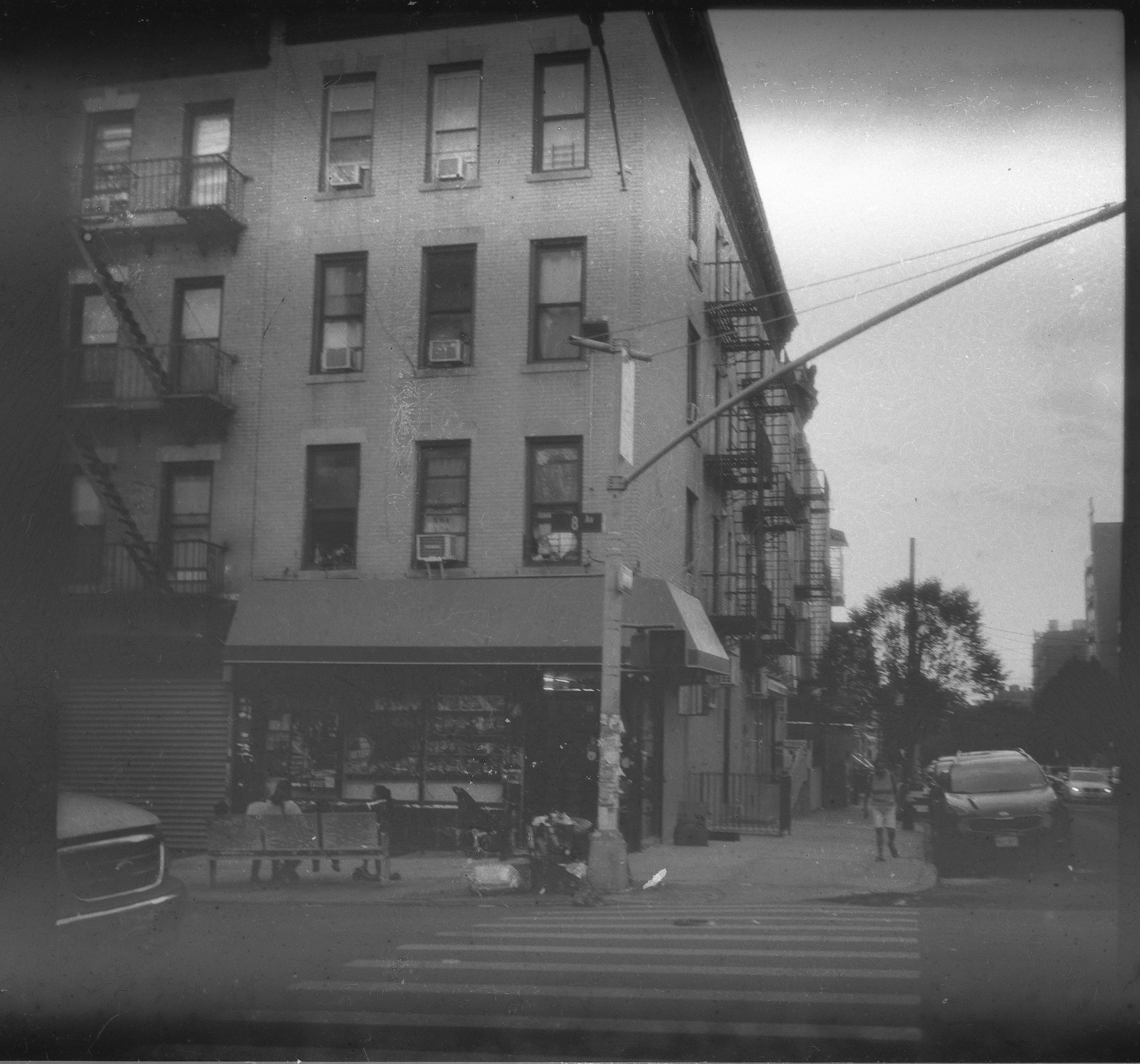
In the fifth shot, we start to see signs of mottling too.
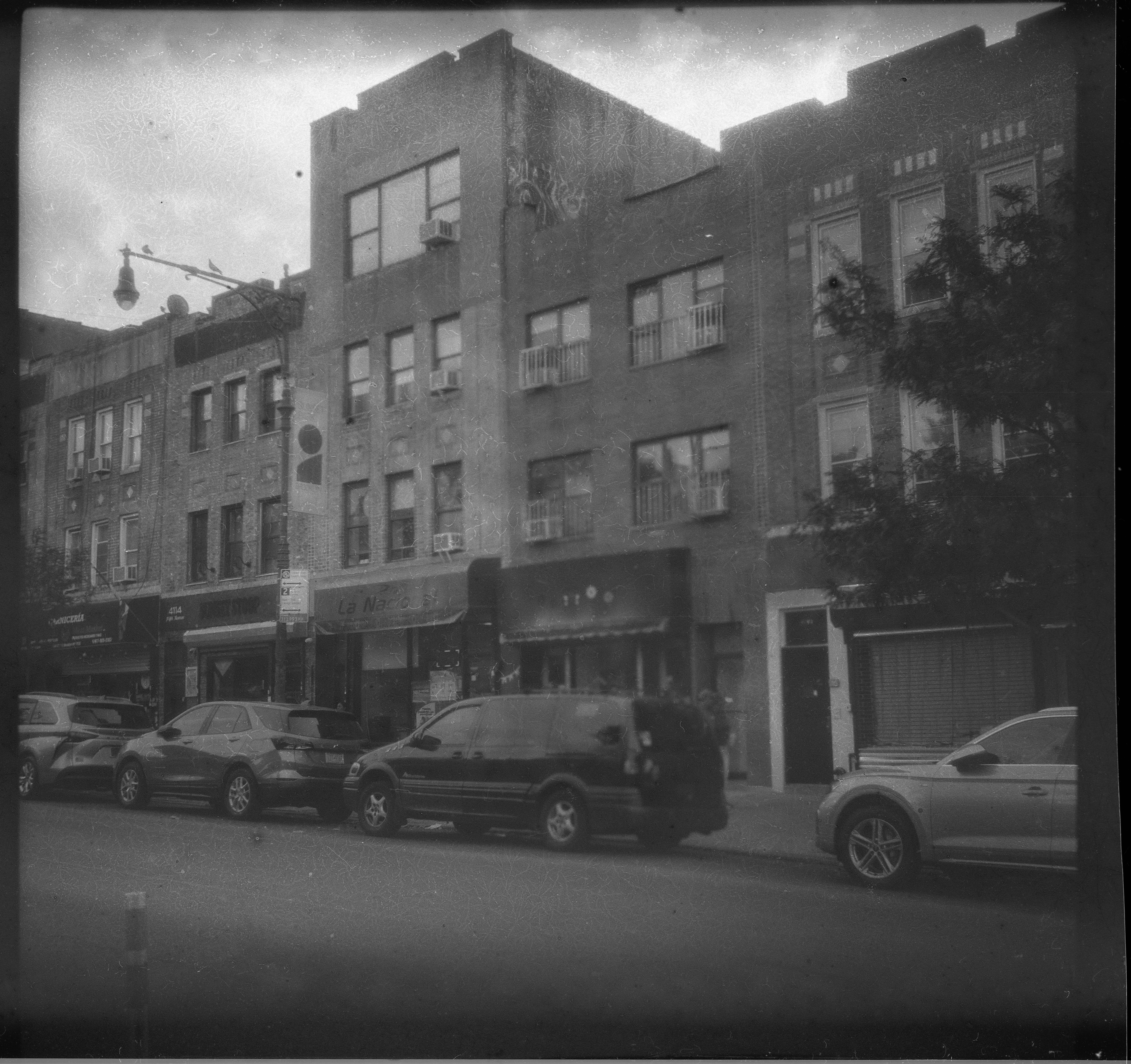
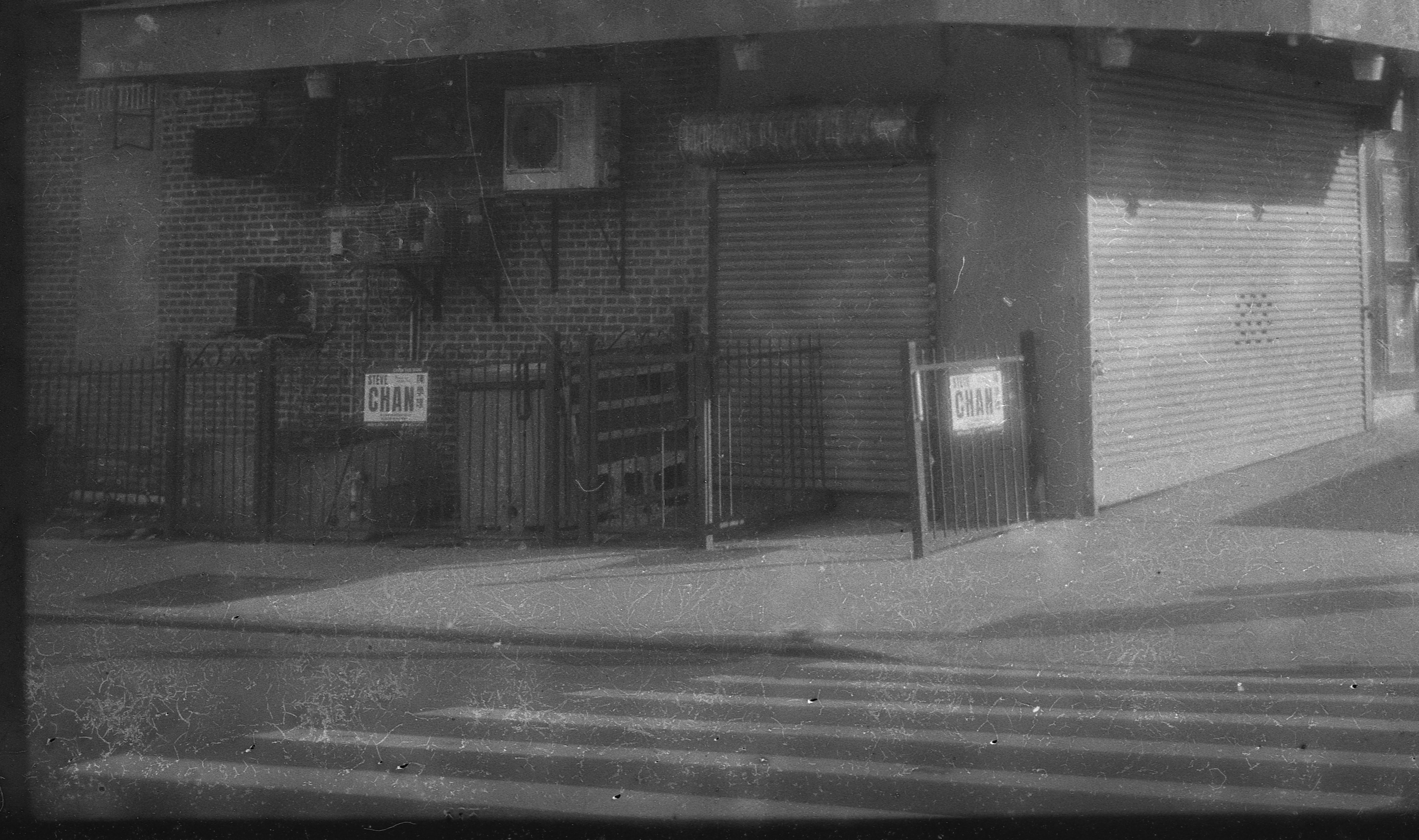
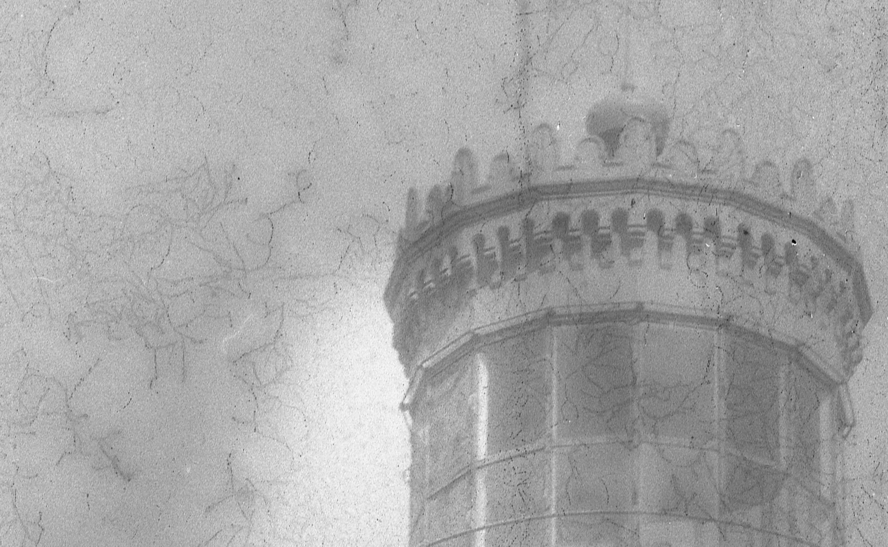
The sixth and seventh shots continue the pattern. Seven is particularly dramatic in the plasticizer lines, particularly evident in the lower part of the picture, shown in close-up.
Eight and nine are more of the same. Ten has some dramatic mottling to go with the lines, as well as black holes in the emulsion.
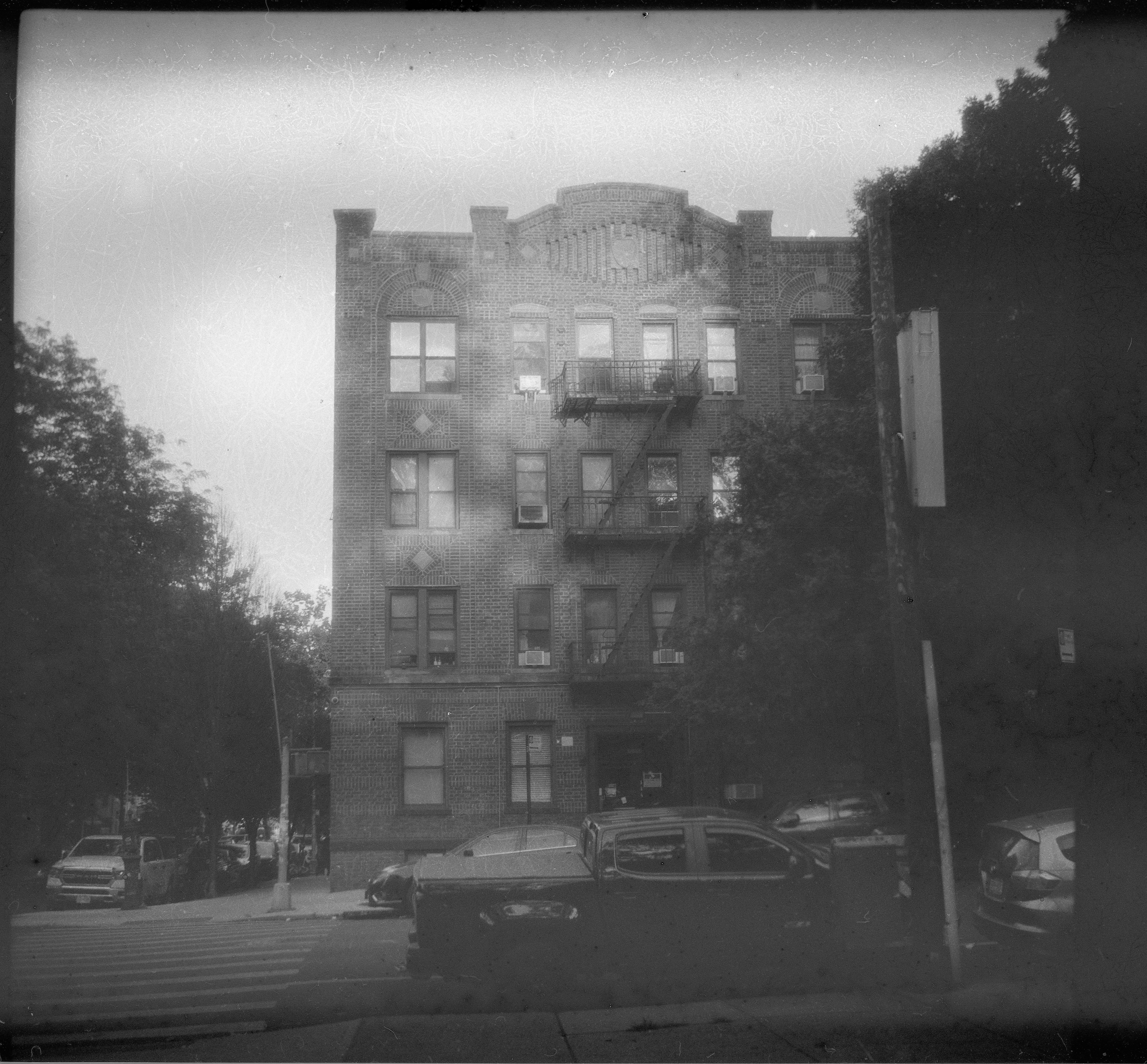
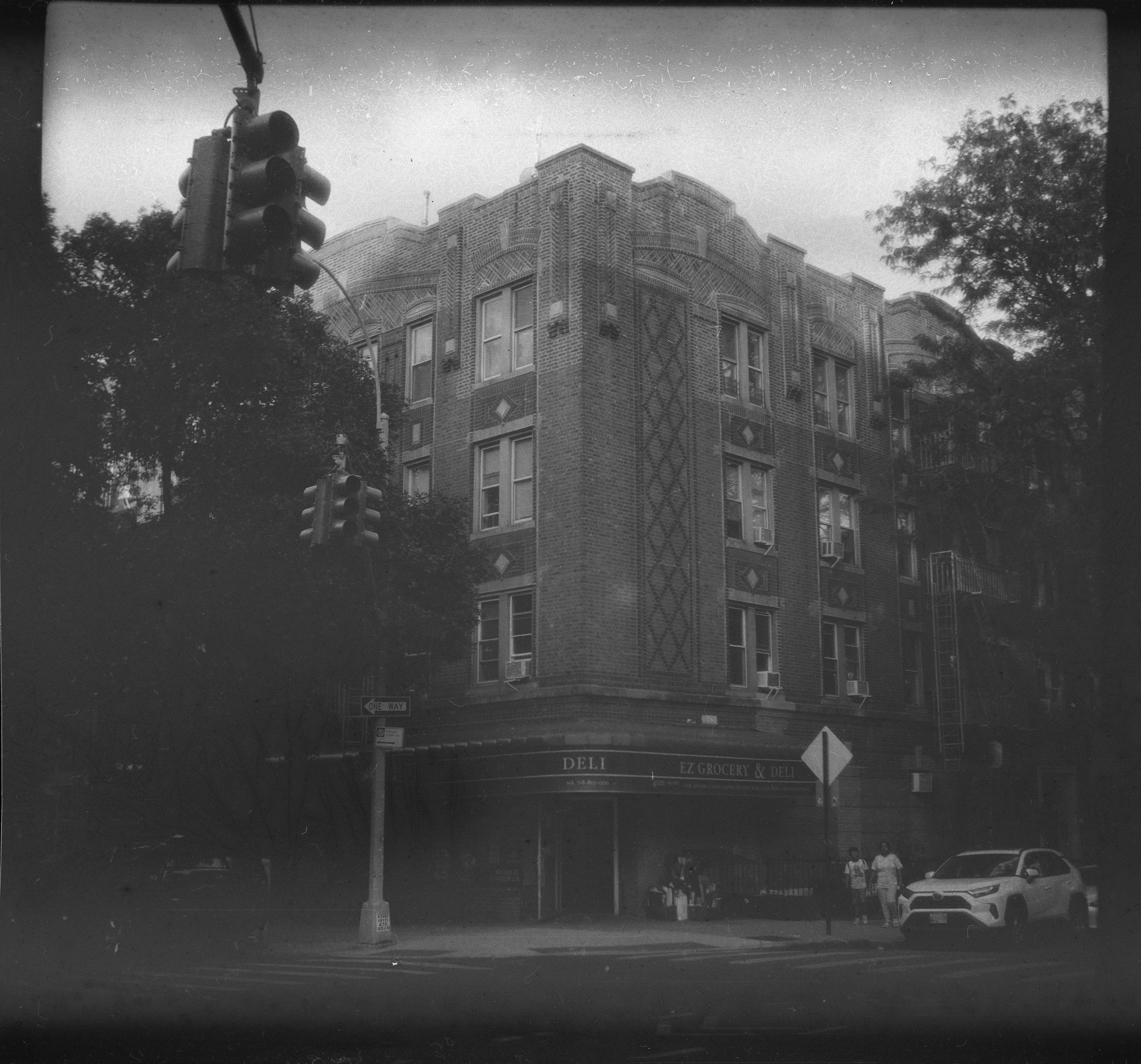
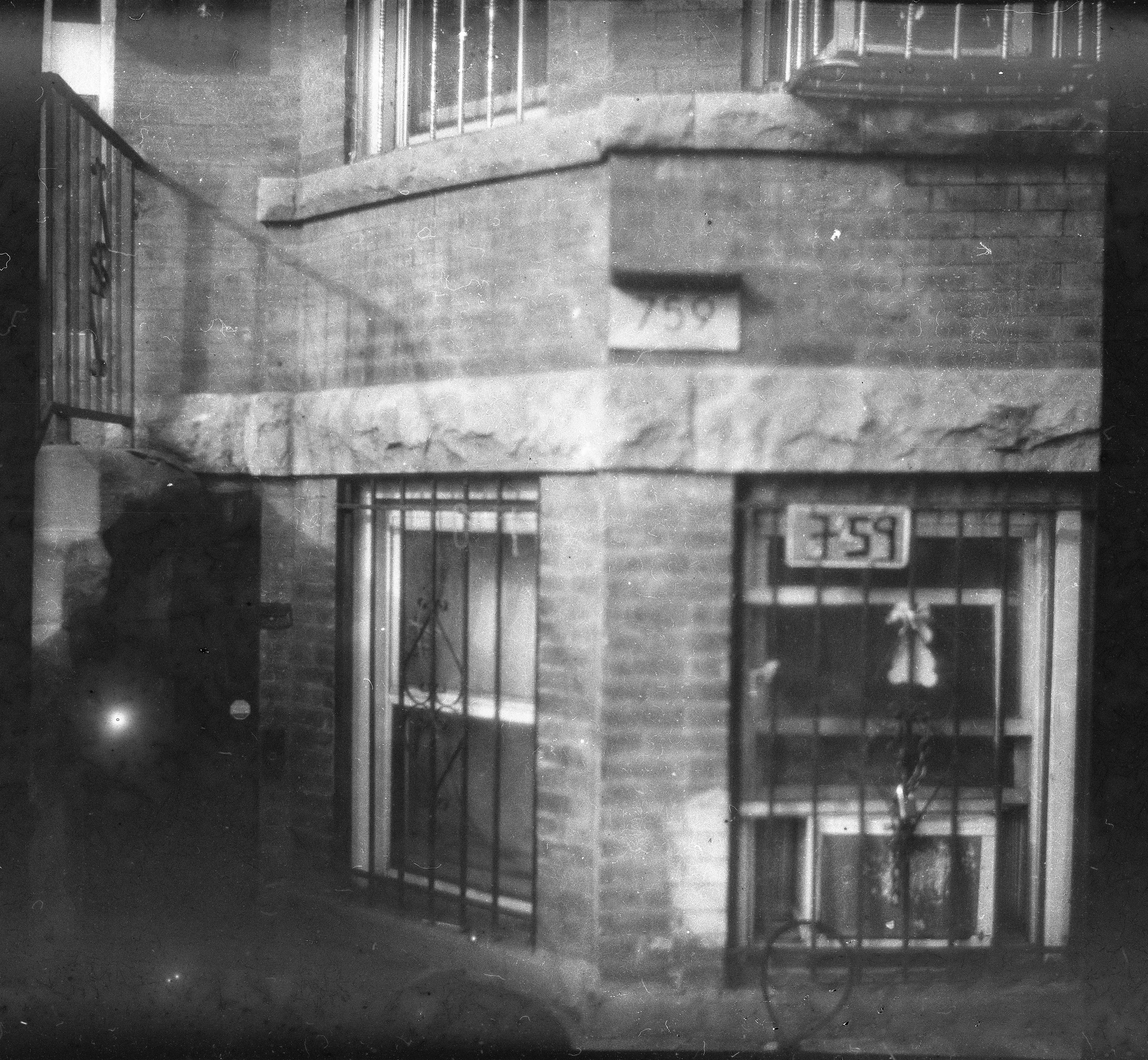
Eleven and twelve dial back the faults. Eleven is kind of blurry, which is on me, not the film. But there are still the issues we've been seeing throughout the roll.
I have one more roll of this to shoot; I'll probably take it to Florida and use it for something that's not critical given the issues I've seen on the first three rolls and expect much the same result. Changing the development process doesn't seem to make a significant difference in the result; 8 minutes worked well from an exposure standpoint, but the artifacts were worse than on roll 2. Ihor and Vitalii have said they think they've figured out what the issues are. I look forward to getting another batch and proving them right.
Posted at 11:03 AM
Link to this entry
Friday, June 19, 2026
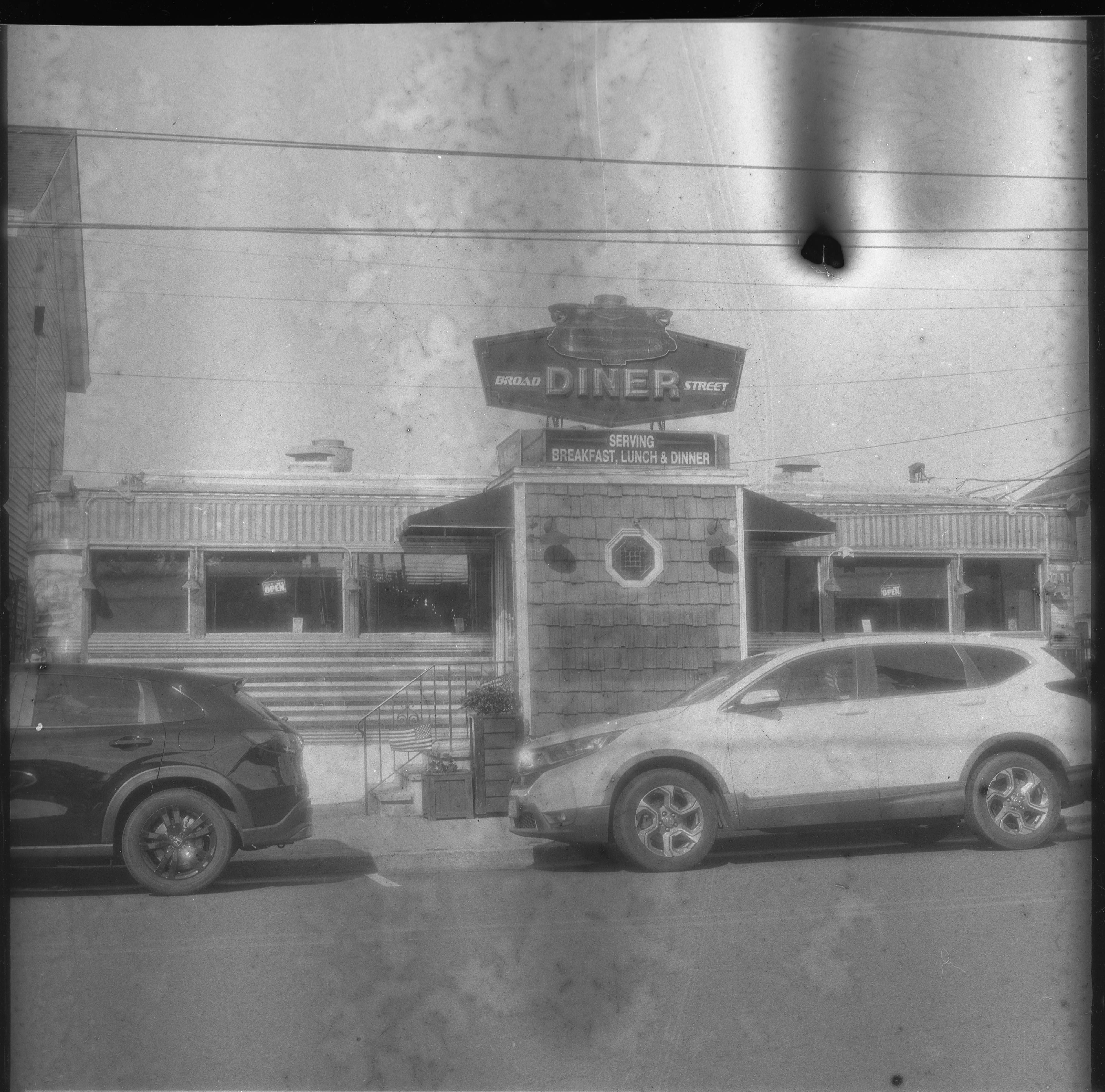
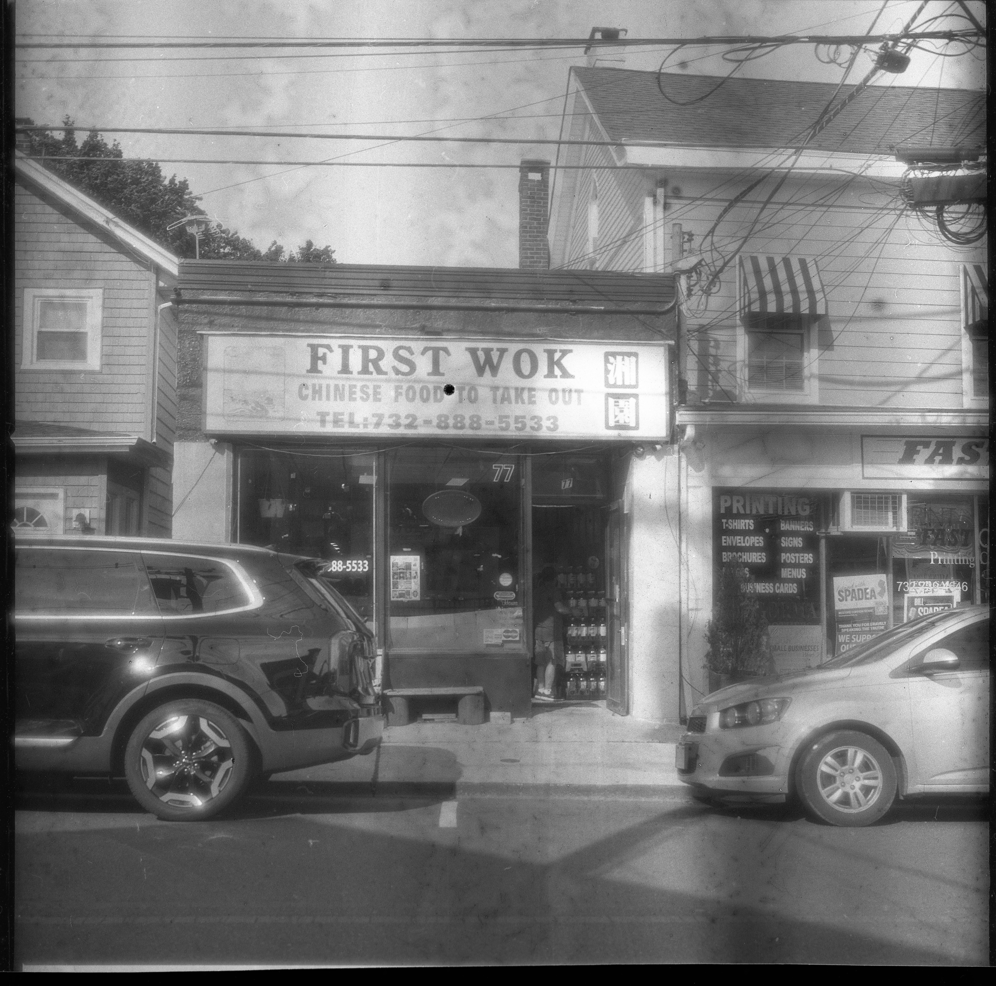
Second Roll of Polyfilm Handmade 120 Film from Ukraine
After going back and forth with Ihor and getting recommendations on how to best develop this wacky film of his, I shot a second roll yesterday. I switched from the Kiev 88 to my Hasselblad 500cm, but made a mistake in loading the film that resulted in me getting only 10 frames and having some overlap between them. I gave the film a pre-wash that lasted seven minutes, cut development from 15 minutes to 12, used an acid stop bath as recommended (I usually stop with water), and rinsed after fixing for ten minutes, something I usually avoid because I use an alkaline fixer and hypo washes out of film much more quickly when you use an alkaline fixer.
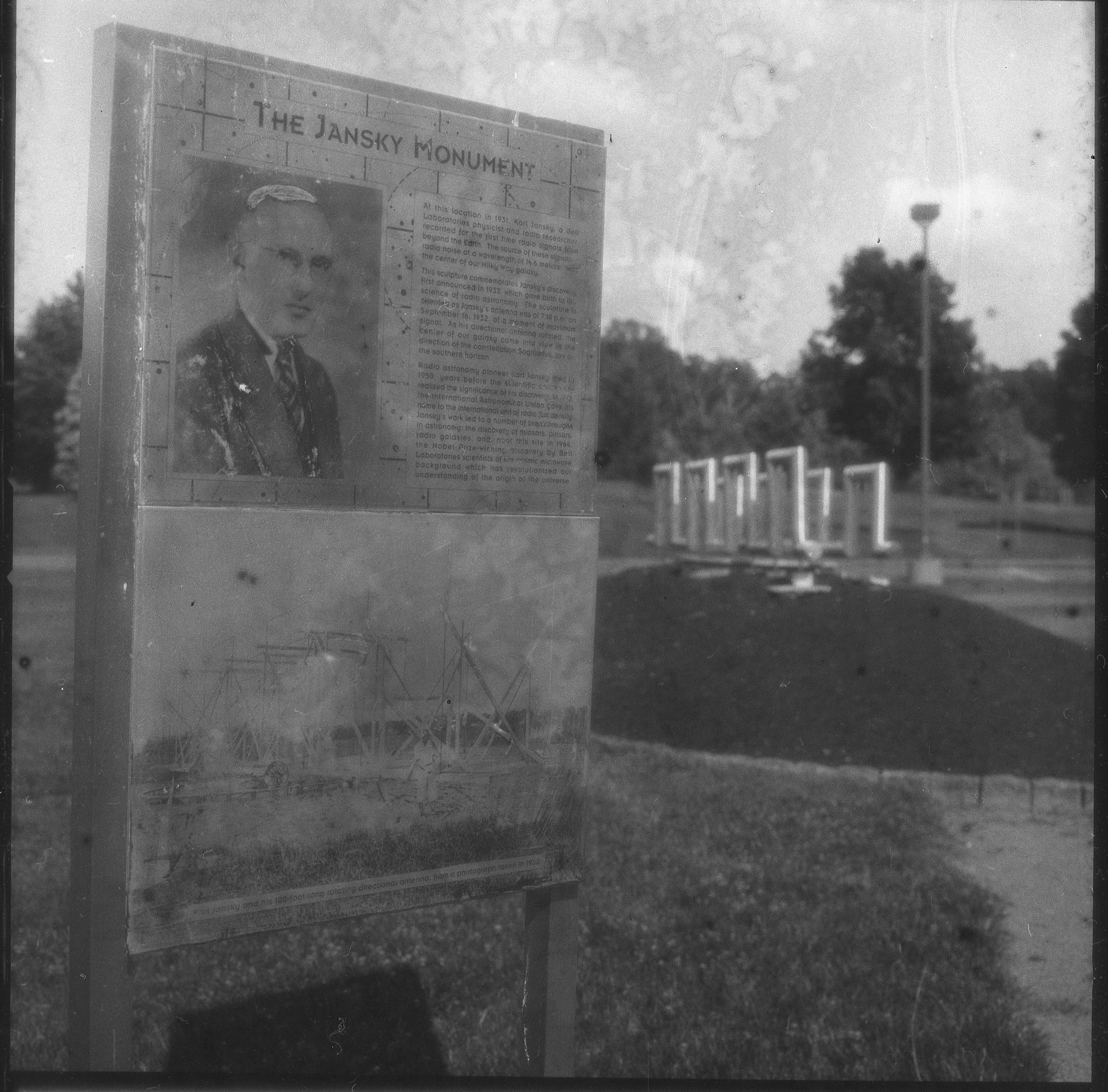
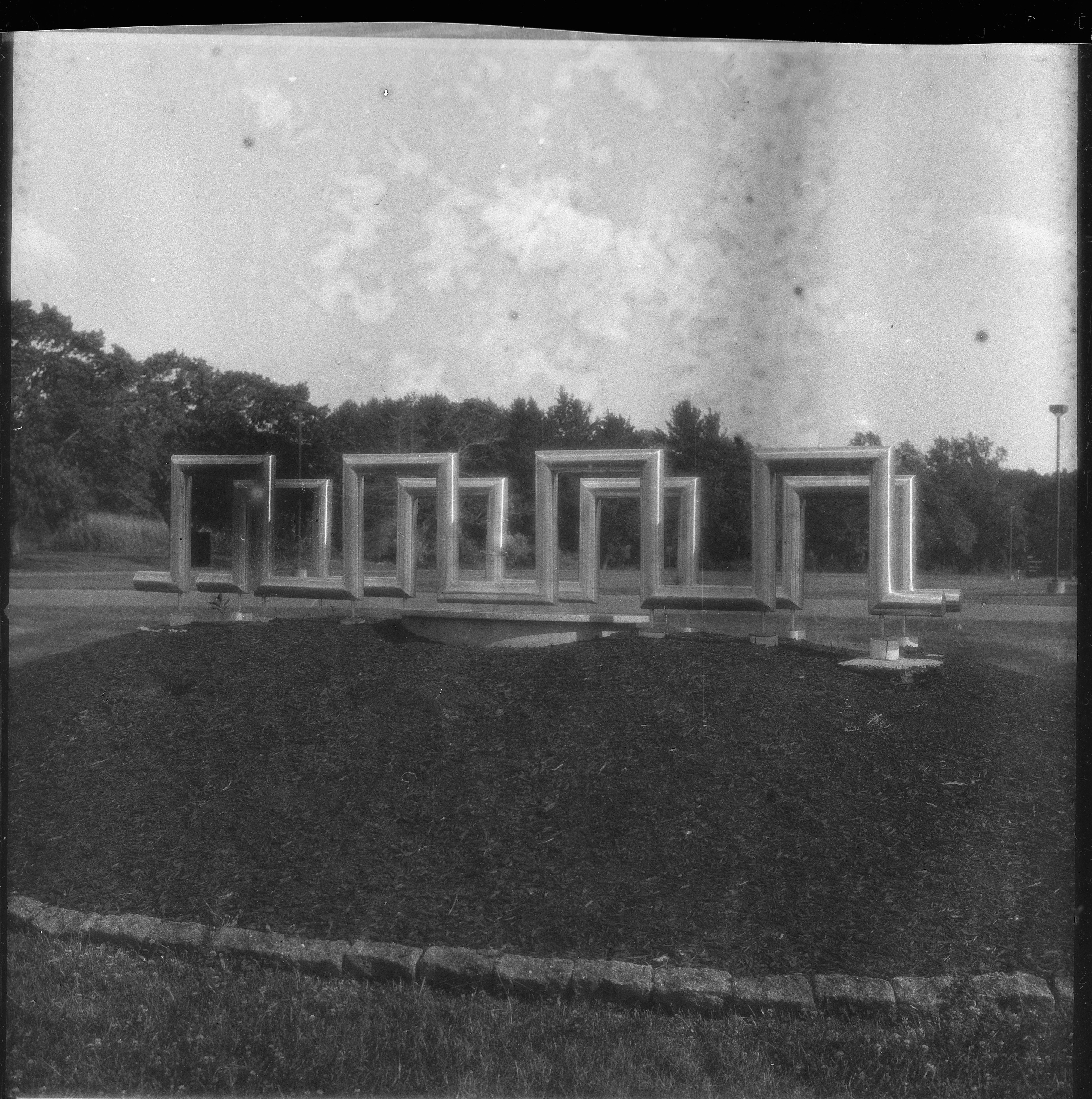
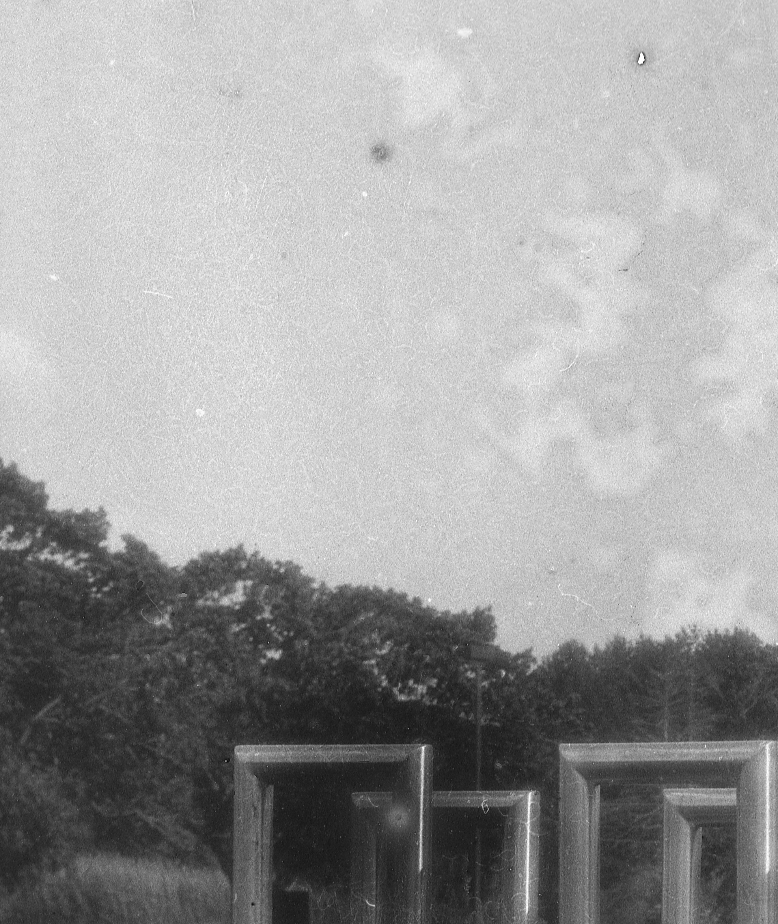
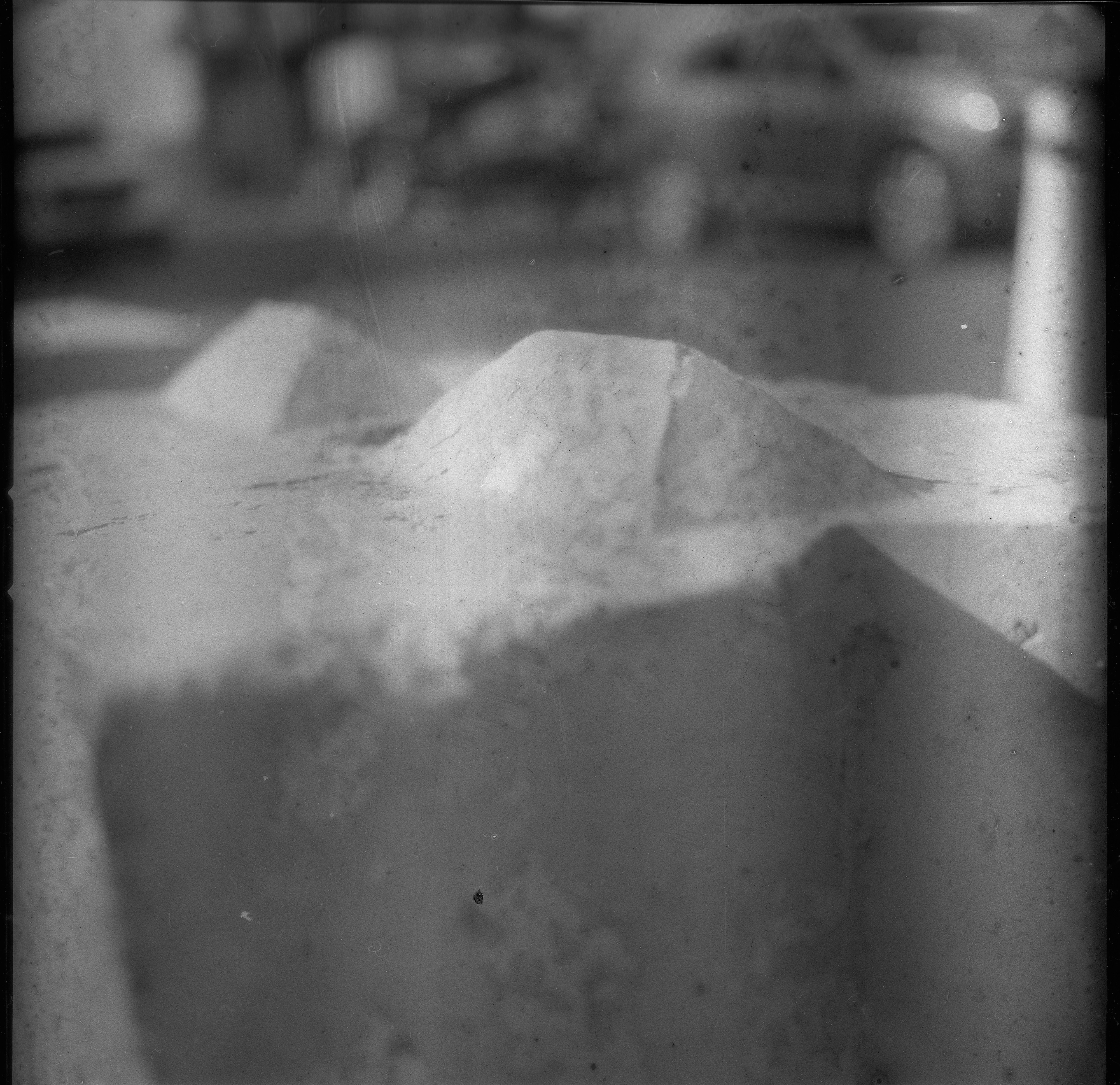
The first three photos show that the lines I got on the first roll are dramatically less present. They're still there, but less noticeable. They are particularly visible in flat color areas, like the sky. This closeup shows the upper left portion of the third photo where they are visible both in the sky and on the metal of the sculpture.
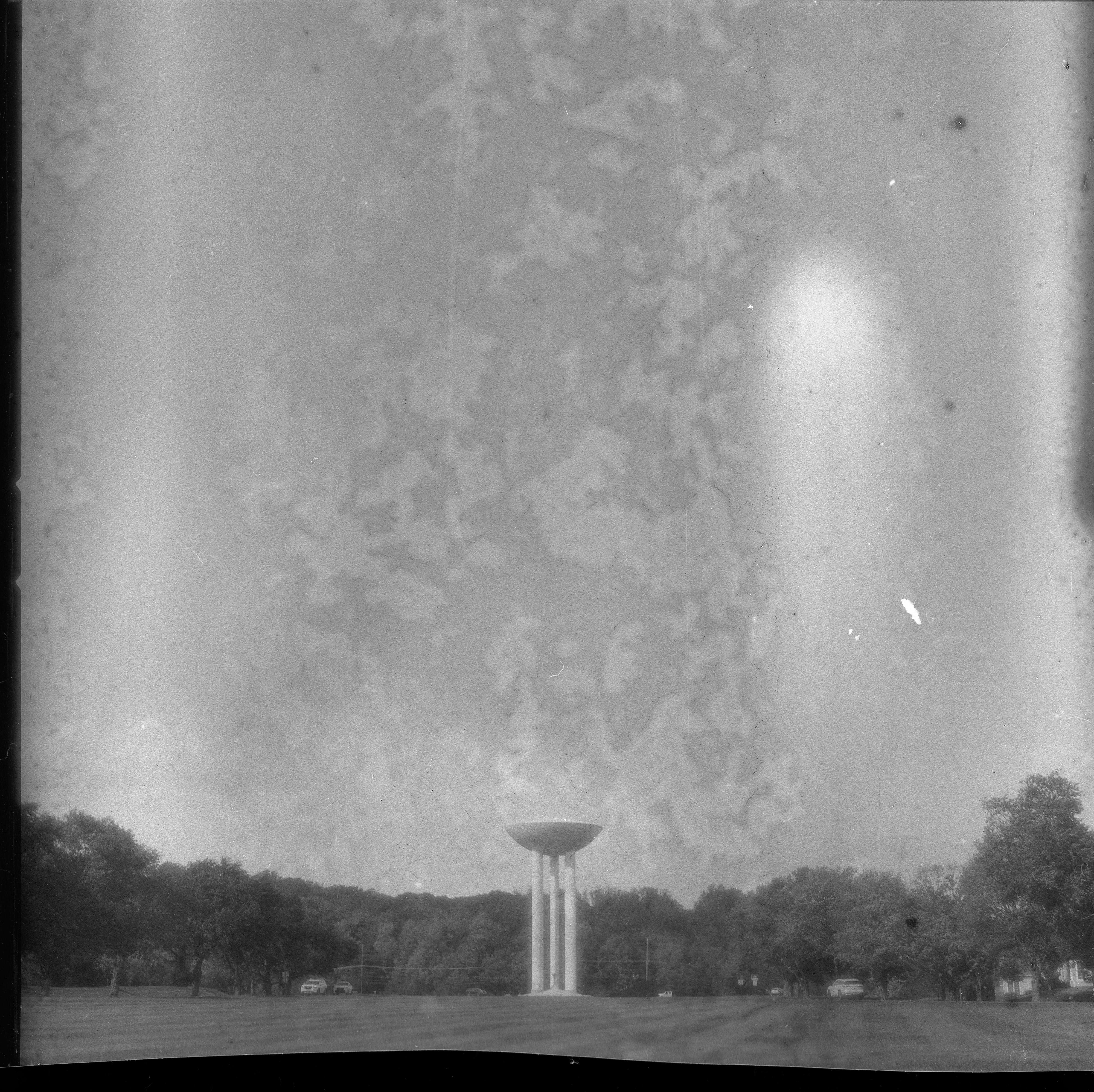
There is, however, this odd mottling throughout the roll, and given the shapes, I think this may also be an artifact of the plasticizers.
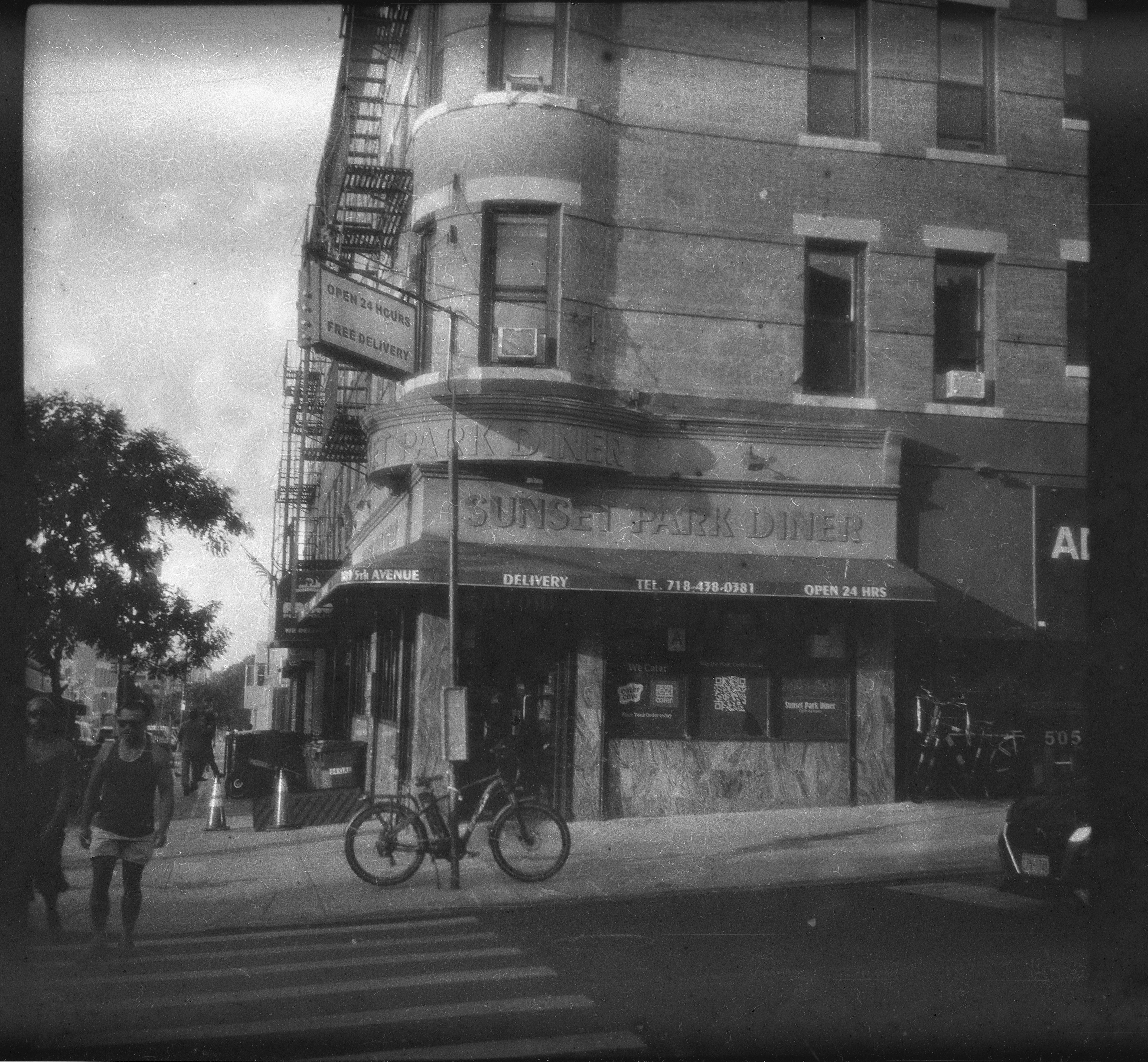
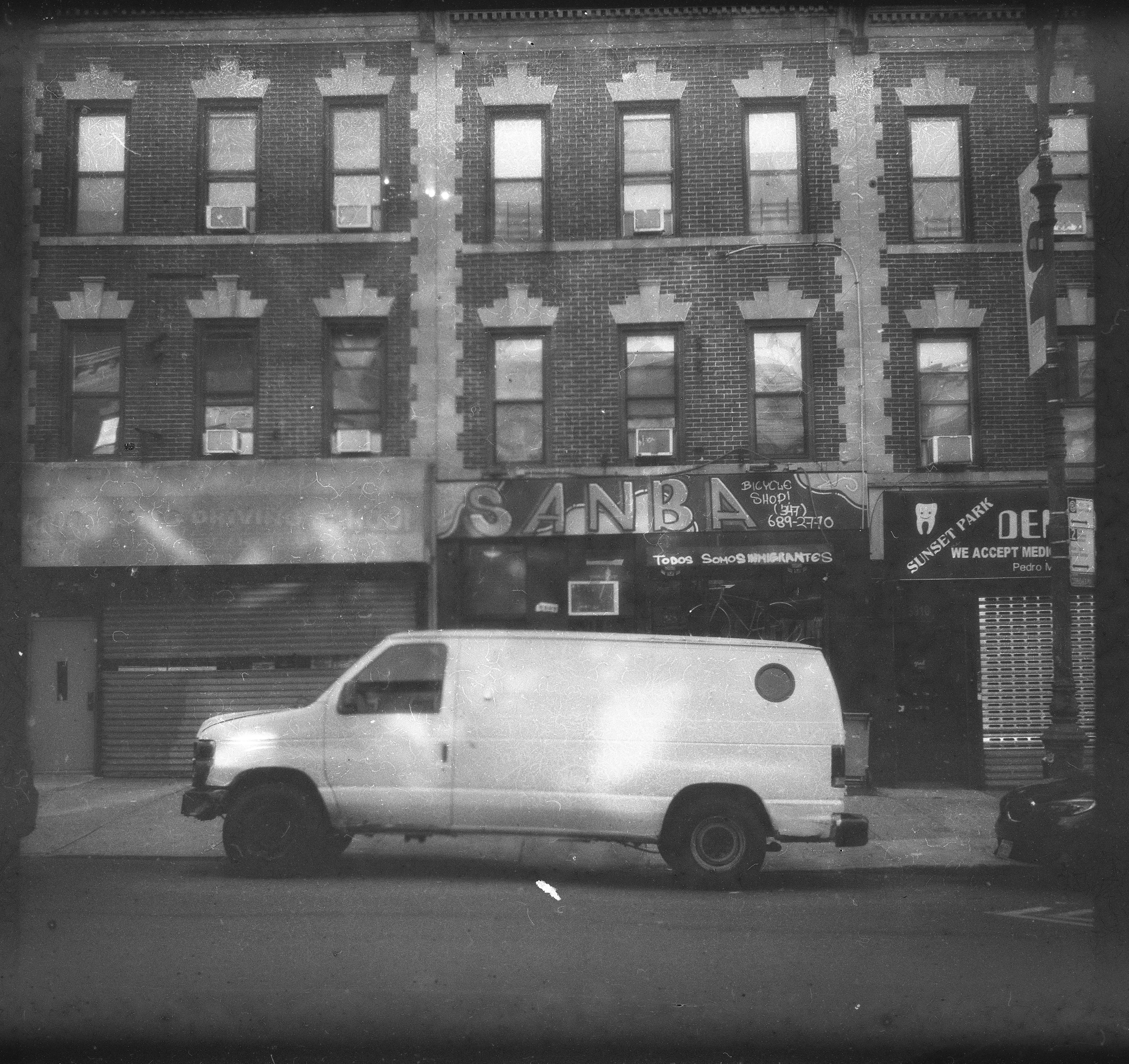
As we get further into the roll, the lines so present on the first roll get harder to find and more localized. In the shot of the diner, they're present mostly to the left of the sign on the roof. In the shot of the Chinese restaurant, they're visible at the left of the frame, but not nearly as disruptive as the previous roll's examples.
The last three photos continue the pattern where the lines are visible primarily at the left of the frame, but less visible than previous. There is more evidence of the hand-coated nature of the film with some verticle lines running through the photos and an occasional black dot where there was probably a bubble or something.
All told, the revised development process improved the film, but I suspect there may be some changes needed in the formulation to lower the level of plasticizers. I don't see this kind of mottling that I got on every shot in the examples I've seen posted elsewhere from other batches by people like Ari Jaaksi and Vitalii Kovalyshyn.
Posted at 1:16 PM
Link to this entry
Wednesday, June 17, 2026
First Roll of Polyfilm handmade 120 film from Ukraine
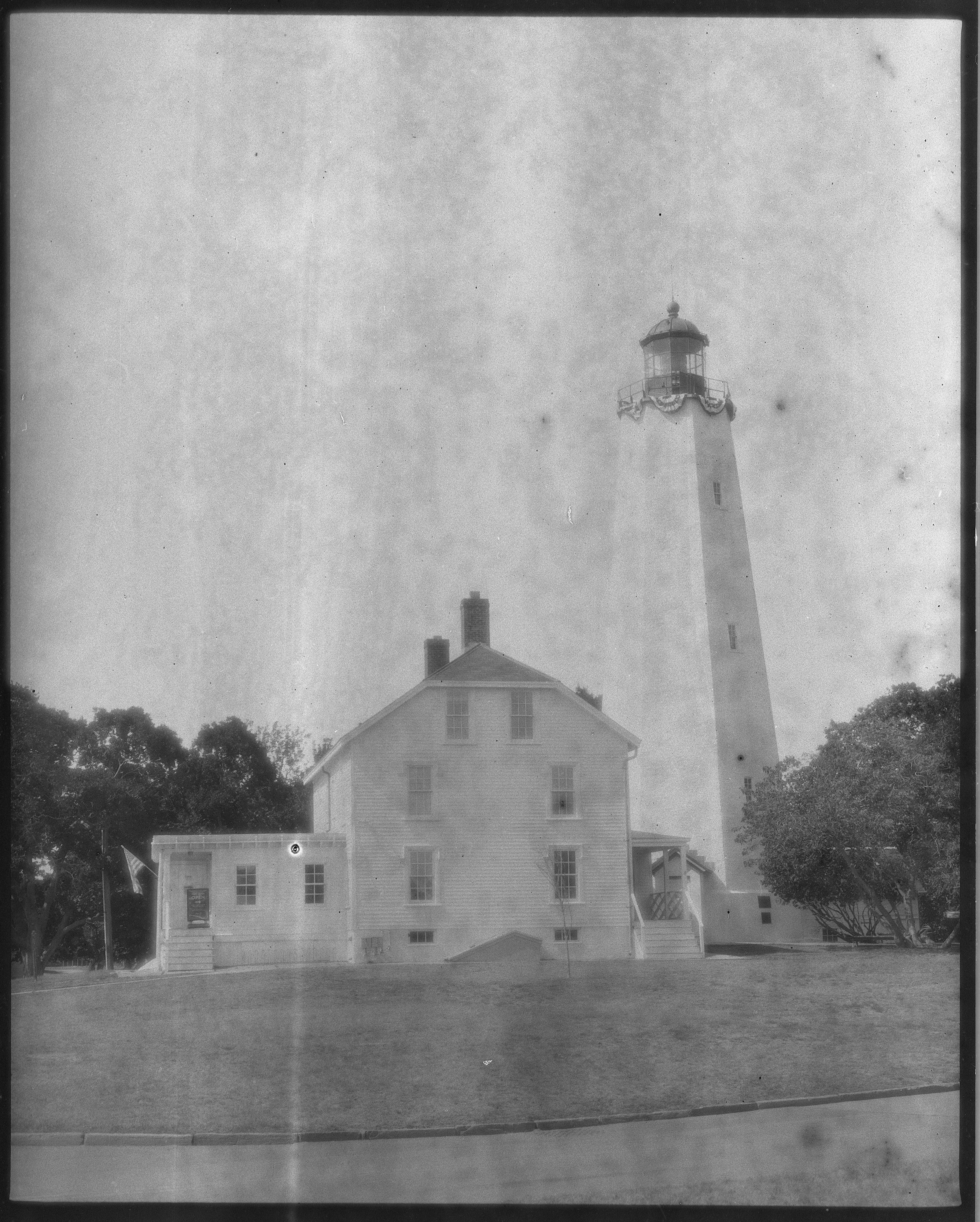
I half recalled my friend Andre from L'viv mentioning on Mastodon a while back that a friend of his was making his own film in his garage, so when I saw this video by Ari Jaaksi a few weeks ago, I wasn't totally shocked. It was interesting; Ari's photos turned out quite well from the rolls he had been sent. I looked into the links that Ari posted to his video and found that I could actually buy up to four rolls of this film. I jumped at the chance (you can't really buy it right now, because the production amount is about 30 rolls per month and the queue is full, but it will reopen at some point). My four rolls of 120 Polyfilm showed up on Monday. This morning, Wednesday, I loaded a roll in what seemed to me to be the most appropriate choice to shoot it in, a Kiev 88CM. Ukrainian film, Ukrainian camera. I used a German lens, though, a Carl Zeiss Jena 120mm Sonnar and went to the nearby Twin Lights lighthouse and the town the lighthouse is in, Highlands, New Jersey.
I shot the whole roll, then brought it home and developed it. One of the two recommended developers is Rodinal, which was pretty much the only developer I used until fairly recently. I developed the roll in Rodinal 1:25 for 15 minutes in my PiraMX Developers Helper, which keeps the temperature at a steady 20 degrees Celsius. Let the film dry for a few hours, and scanned it. I'm posting the whole roll. Ihor Poliakov, the guy who makes the film, said in his note that came with the film that it is not perfect, and that's very true. I got some very odd results that I didn't see in the online posts of film from other batches.
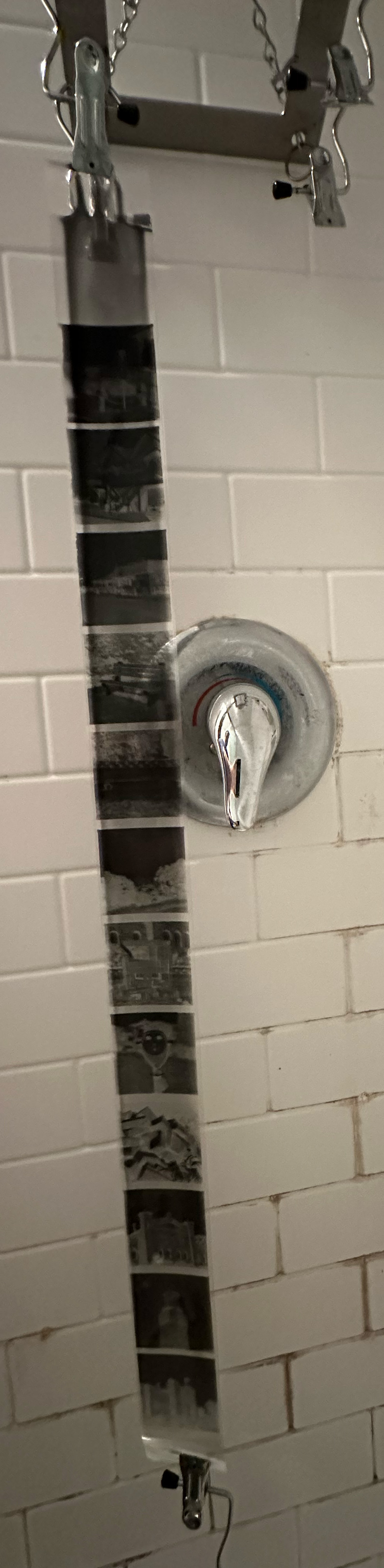
This was the roll hanging to dry in the shower after development. The first thing I noticed was the appearance of the exposed emulsion at the top of this strip. That emulsion doesn't spread the entire width of the film, and makes me think this film, or at least this batch, has an issue that other batches didn't. My understanding is that the film is coated twice, once with something that actually sticks to the base and once with a photosensitive emulsion. It's not clear to me if the first coating is also photosensitive, but there are clearly two photosensitive coatings on this particular roll, and one of them did not span the entire width of the film.
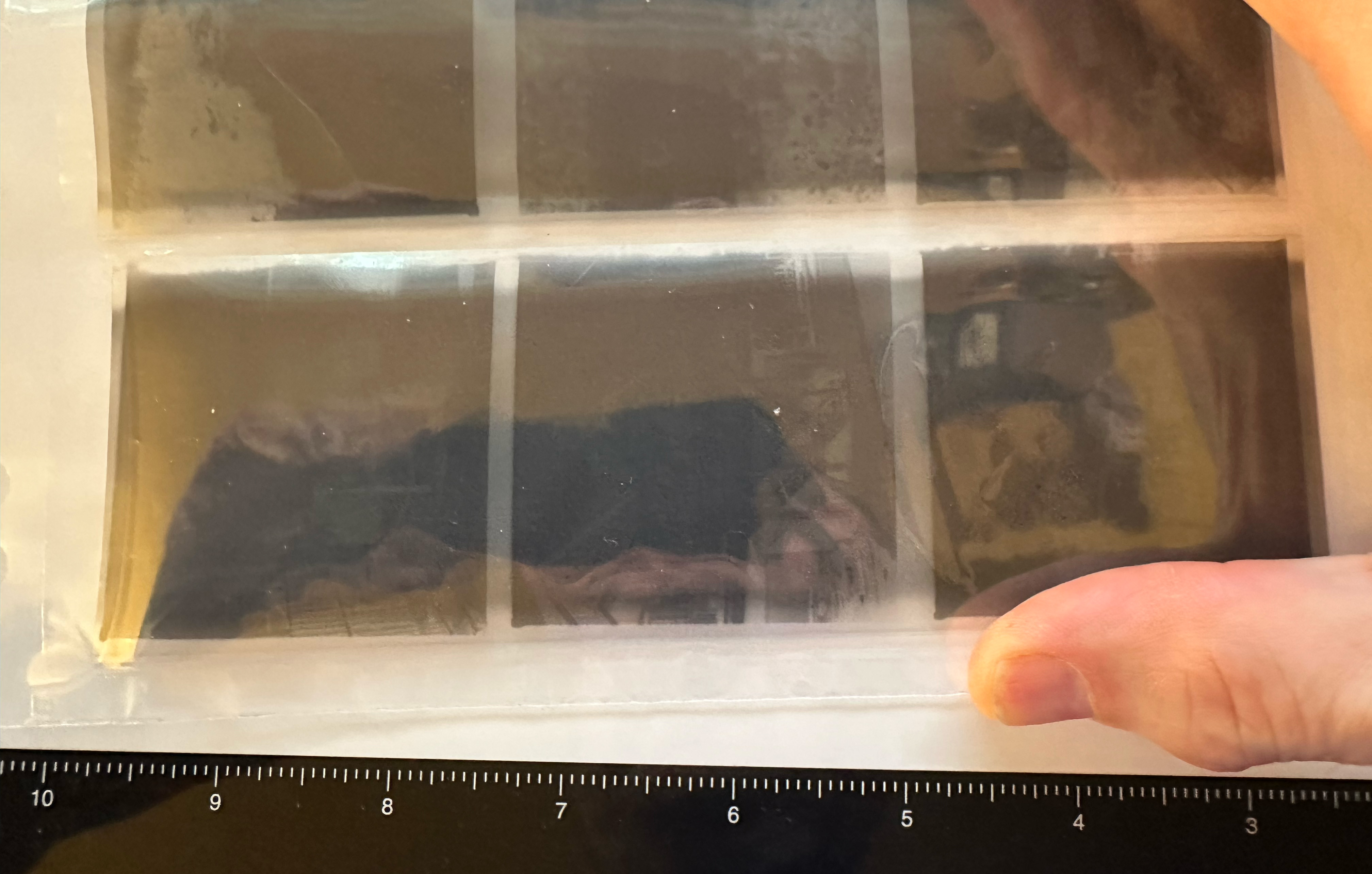
Looking more closely at the film, the space between frames also shows this coating of emulsion showing some degree of exposure, not covering the entire width of the film.
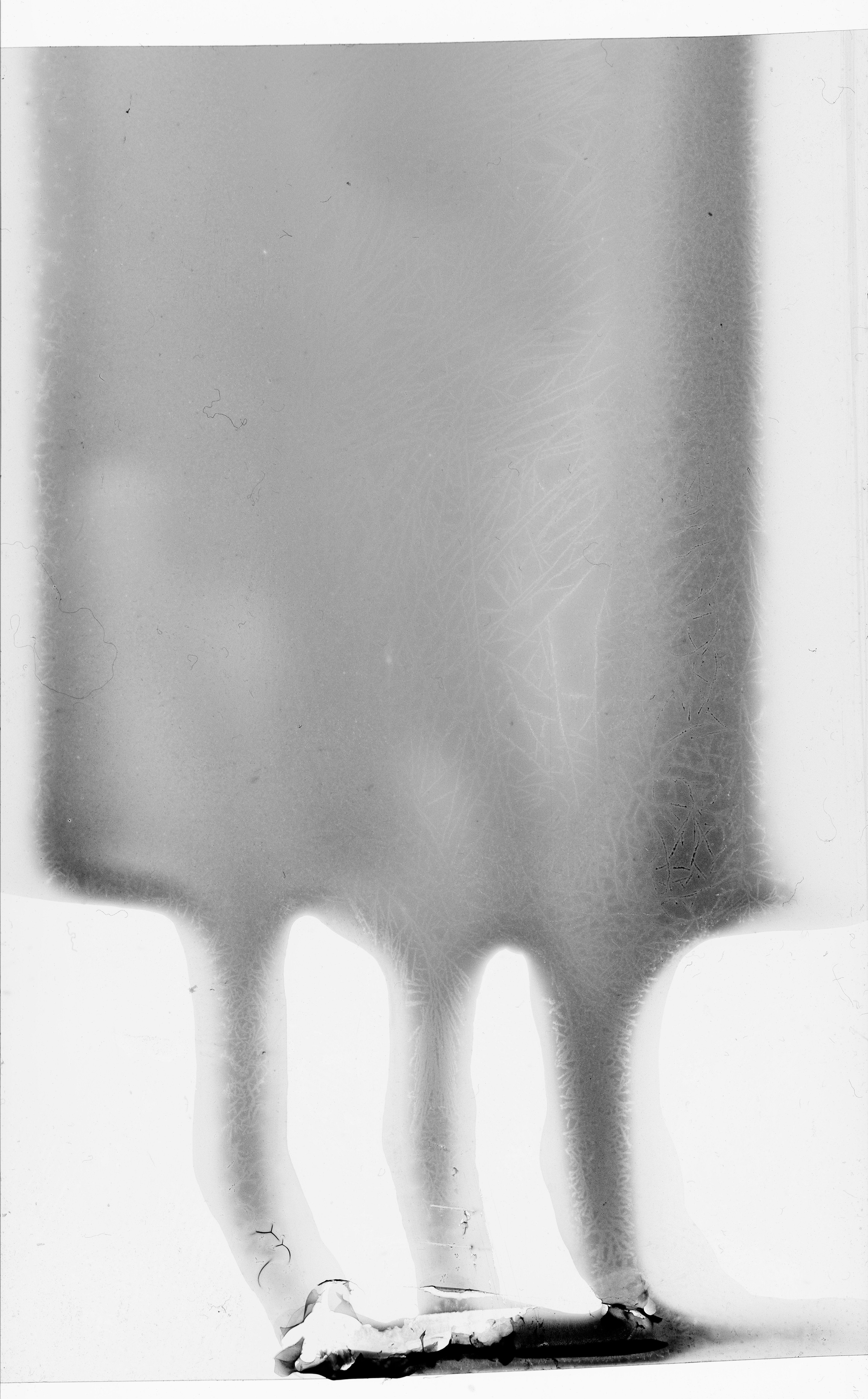
This is a closer look at the blob of exposed emulsion that's visible at one end of the film.
I don't know if this happened with all the rolls in this batch, or just this one. This is batch 260526. I'll be looking out for the other three rolls I have to see if this happens with those or if this was a one-off.
I didn't do any adjustments to the raw scans I made of the developed film, so they look a little flat. I spotted things that were identifiably dust, but other flaws in the emulsion were left as is.
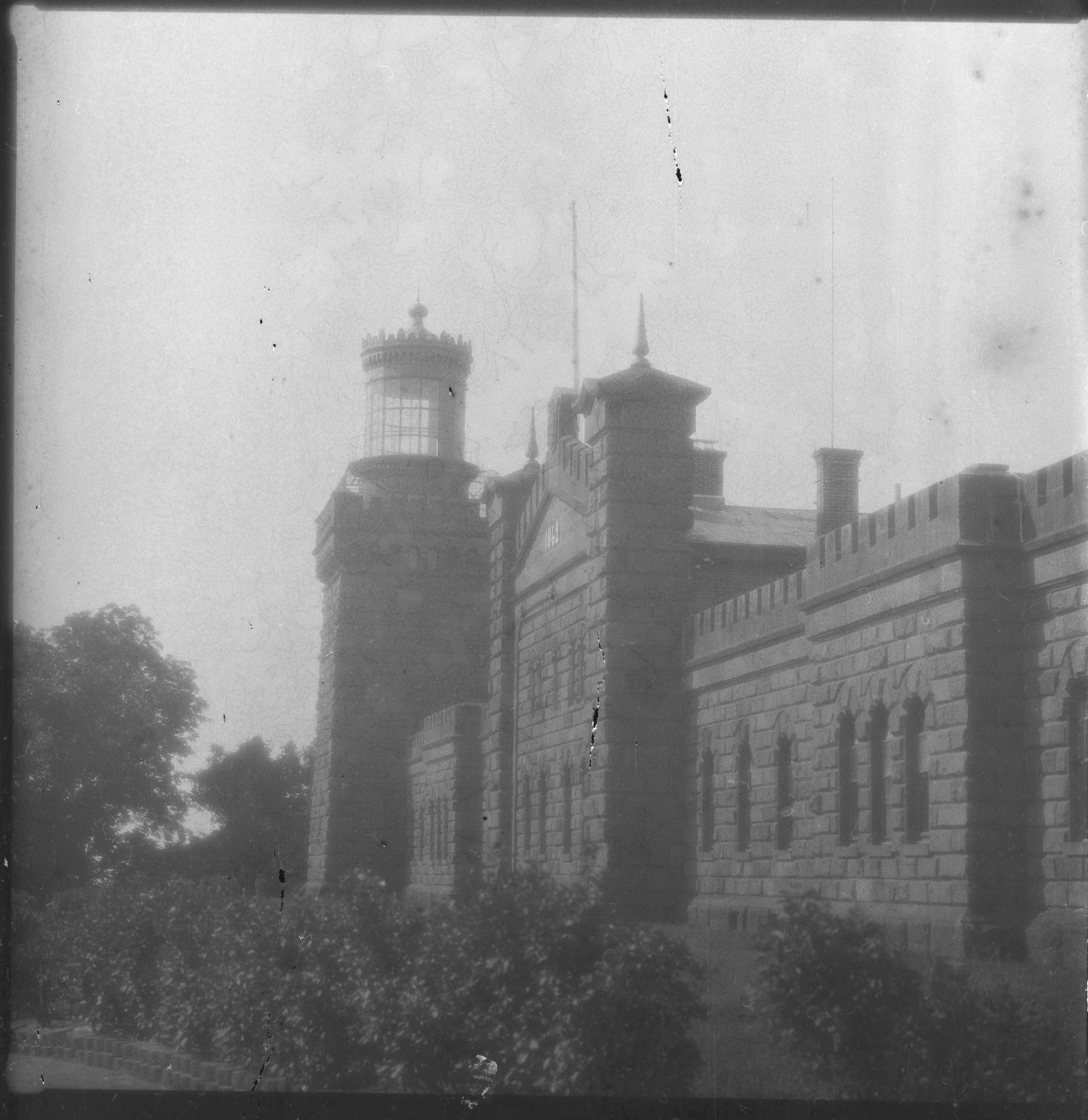
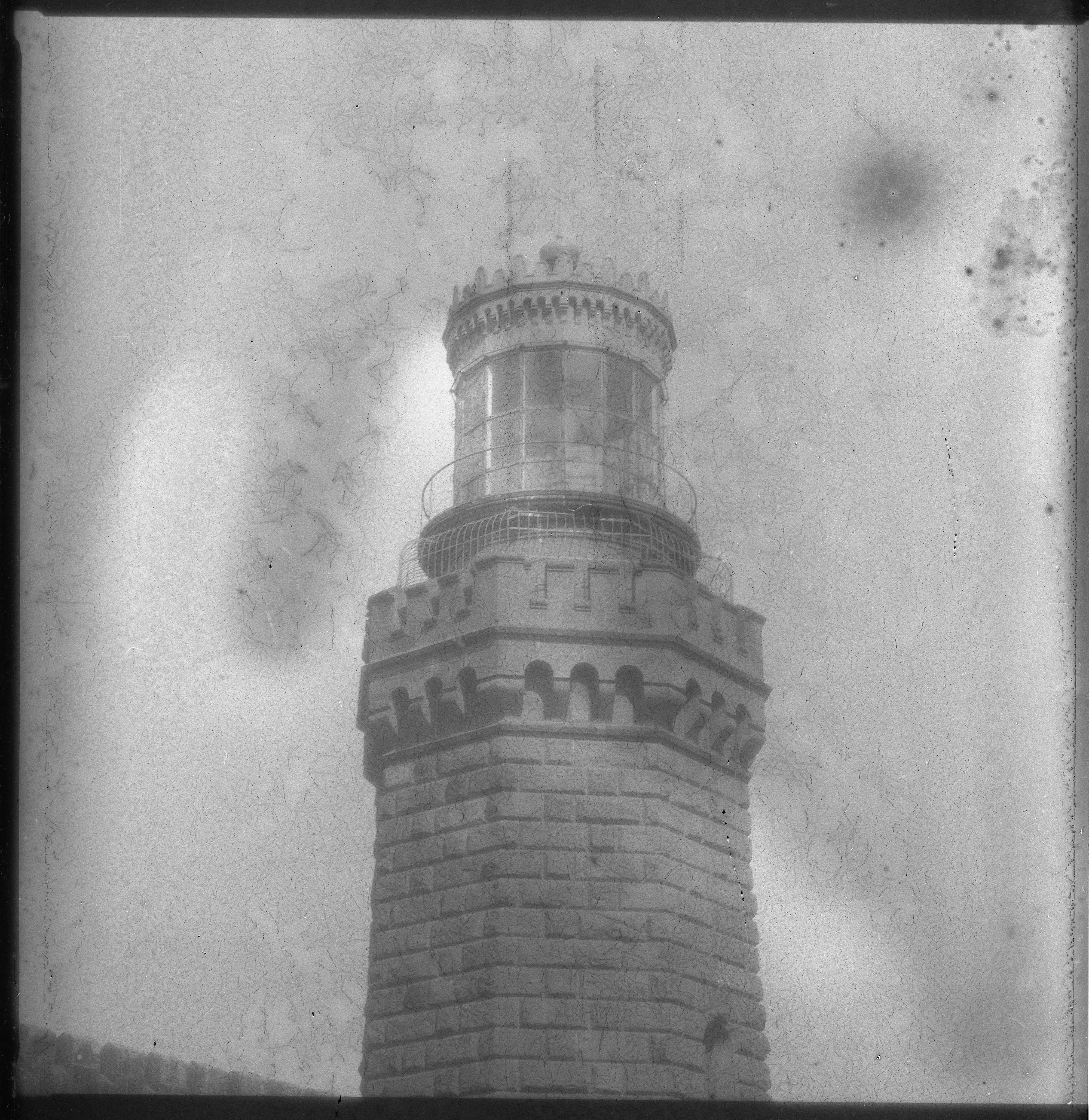
The first couple of shots show some interesting artefacts. Black dots off to the right remind me of little concentrations of silver I've occasionally seen in wet plate, oysters and comets. There are a couple of spots where the emulsion looks damaged, one in the sky and one on the center body of the lighthouse building of the first shot. Then there's the lines. They're visible somewhat in the sky on the first shot, but much more visible in the second. They look like some sort of crystalization of the emulsion or something, and they're present on every shot on this roll. This 100% zoom of the second photo gives a better look at it.
The next several shots all show the crystalization to greater or lesser extent.
The next three photos show the increasing degree of difference in exposure at the edge where the two layers of photosensitive emulsion give way to a single layer, since the one layer didn't cover the entire width.
The final two shots show another interesting oddity that may be another form of crystalization visible mainly in the upper right of each shot.
My first thought when I saw the scans was that maybe there was reticulation, but I developed the film in my PiraMX Developer's Helper, which keeps the temperature constant, and the water I used was not at a signficantly different temperature. So I don't think it was reticulation.
It will be interesting to see if other users who got this batch get similar results, and if I get similar results from the other rolls I have. I knew when I bought these that it was an experimental film, so I'm not surprised there are flaws.
I shared this post with Ihor on Patreon before posting it, and he thinks the lines are caused by the plasticization he uses in making the emulsion. He thinks spending more time washing the film can take care of that. He sent out e-mail suggesting exposure at 25-30 ISO, dropping development to 12 minutes in Rodinal 1:25 from 15-18, pre-washing for 2-3 minutes, and 5 minutes of rinsing at the end. I'll give that a try for the next roll and see what happens.
Posted at 10:24 PM
Link to this entry
Friday, October 24, 2025
A Visit to the Autophoto Museum + Gallery in New York City
Last Friday Laura and I went into the city. One reason was to visit a new museum, the Autophoto Photobooth Gallery + Museum on the lower east side. They have several working old school photobooths which you can use. We're always on the lookout for these old booths. New Jersey used to have a few, but they're all gone here.

The first booth we used was a Model 14 that sits in the front window. It's in great shape. Very late 1950s, early 1960s look to it, a style we used to see a lot of on the Jersey Shore.

There was a booth to do color photos next to it, but the color paper is in short supply and they weren't operating it the day we were there.

Next up was a Model 21, very stylish, more of a 1970s vibe, bright colors and the like.


Up next was a rare Polaroid photobooth. For some reason, these never quite caught on, so there weren't many made. I think I've only seen a couple in the wild over the years, and not for many years.

I think this booth could probably use some adjustment. The photo looks underexposed to me and has a distinct green cast.

There is a Model 9 next to the Polaroid booth, but it is non-functional. The Model 9 was the first model produced by Autophoto, and is fairly primitive by comparison with later models like the Model 11, which introduced the ability to process more than one strip at a time.

There is a display in the back that shows the inner workings of a photobooth using a partial Model 20 with the front wall replaced with plexiglass.


There are also other displays about the history of photobooths. I didn't get pictures of all of them. I gather the displays will rotate. One of the displays was an art book of photographs of photobooth technicians.

Next up was a Model 17 that was only sporadically working. We paid our money and the strip didn't come out. In this picture you can see one of the docents working on the innards while on the phone with "Bre", the owner of the museum and most of the machines. When Laura had told me about the museum, I figured there was only one person with the assets to pull it off, and when the docent told me she was on the phone with Bre who was helping her troubleshoot, I knew that I was right, this was the brainchild of Breanna Conley Saxon, who was interviewed about photobooths on the much missed All Through A Lens podcast a few years ago.

She was able to retrieve our photos from the booth, somewhat damaged. We got a free sitting in the one booth we hadn't used that day, a Model 11 that had been converted to digital. The 11D outputs two strips of three photos each, a total of six photos, oriented horizontally rather than vertically. The photo quality is surprisingly similar to analog photo booths.


As a museum, it's good that they have an example of a digital conversion, but it pains me to see these, as it is how so many of these booths have wound up. The booth on the boardwalk in Asbury Park that used to be in Palace Amusements and in the basement of a mall on Cookman Ave. now sits in the Silverball Pinball Museum on the boardwalk converted to digital. Boo!

The last photobooth we tried was a rare Model 12, which produces larger photos, but only in a strip of three. The photos it produced look a little overexposed and washed out to me, which honestly is kind of in keeping with how they used to look back in the day. You could get some that were underexposed or underdeveloped, overexposed, or perfectly exposed and developed, depending on maintenance and the state of the chemicals. And that's one of the things that makes getting these so much fun.

The museum is tiny, just a storefront on a side street, and it was packed on the day we were there, about a week after it opened. The have a souvenir shop in the middle of the space.

I have to be honest, this was not a cheap date. Most of the photo booths cost $8 for a strip; the color booth and the Model 12 cost $12. That's actually in line with costs at other booths in NYC, maybe at the high end, but the booths are well maintained and in great shape. The souvenirs are also pretty expensive. That didn't stop us from getting anything, but it's worth keeping in mind if you're on a budget. Entry to the museum is free; they make their money on the use of the booths and the souvenir sales.
We had a wonderful time and really enjoyed out visit.
Posted at 3:20 PM
Link to this entry
Saturday, August 23, 2025
Getting Into The Weed, Photographic Chemistry Edition
I've spent the last couple of weeks reading up on photographic chemistry. It started when I got the new 5th edition of The Darkroom Cookbook by Steve Anchell. I have three previous versions and it's a classic. There's a lot of great information in there. This is the book that convinced me to go to an all alkaline development process for my black and white films. Turns out that when you use alkaline fixer, the bad stuff you need to wash out (specifically hypo, typically sodium or ammonium thiosulfate) just drops right out after about 40 seconds of washing, unlike acid fixer, which requires a good ten minutes of washing. I started using Photographers Formulary TF-4 when I tried using a Pyro-based developer several years ago. Pyro didn't stick; I didn't see any benefit from using it. But the fixer did. And when I read The Darkroom Cookbook's earlier editions, I understood why it's a good idea. The new edition has a new section on digital negatives. I think I'm going to try the approach laid out there. I've tried others with step wedges and never really got things dialed in. I'm considering trying Platinum/Palladium printing, and digital negatives would come in very handy for that.
Steve Anchell also helped out on another book, The Film Developing Cookbook, whose primary author is Bill Troop, who it turns out formulated my favorite fixer, TF-4. The Darkroom Cookbook points to The Film Developing Cookbook for elaboration on several items, so when I finished The Darkroom Cookbook, I pulled The Film Developing Cookbook (second edition) off the shelf. Again, another very worthwhile read.
One thing that I noticed reading it this time is that Troop calls out a man named Grant Haist quite often. Now, I happen to know who Haist is. He was a research chemist at Kodak and an author and also a fine arts photographer. I have two of his books, George Eastman's Cameras, which is a survey of all the cameras Kodak put out during Eastman's life, and Modern Photographic Processing Volumes 1 & 2. I happened to discover Haist, who died in 2015, when many of his cameras went up for auction on the auction site Everything But The House. I wound up buying four of his cameras: A 5x7 Press Graflex that gets mentioned in his George Eastman book (he even mentions the serial number in the book, which is the one on the camera I bought), a Graflex RB Super D 4x5, a 4x5 Super Graphic, and a 4x5 Super Speed Graphic. Those latter two were the end of the line for the Speed Graphic line, and oddly, didn't have the focal plane shutter that distinguished the Speed Graphic from the Crown Graphic. I find those two less useful than my older Pacemaker Speed Graphic. Anyway, I have this two volume set by Grant Haist that I bought from the same estate sale, and I hadn't read it because it looks daunting, but I figured it was time after reading these other two books, one of which quoted him extensively.


It was a lot less daunting than I expected. It is a bit chemistry heavy, but that's a good thing, and the first couple of chapters are basically a lesson in chemistry down to the atomic level, learning about electrons and how elements bond and stuff like that. It's a good basis for the rest of the books. Volume 1 has most broadly interesting stuff. It explains how film stores the latent image when you expose it, and how developers amplify the latent image and make it visible, down to the atomic level. I have a much better understanding of how developing black and white film works after reading this. Then there ar several chapters that describe various classes of developers. There are of course solvent and non-solvent developers, but even those can be broken down. He even covers my favorite, Rodinal, briefly. There are formulas for dozens of different developers, as well as explanations of how they work. The Anchell and Troop books have a lot of this in them, but Haist goes over and above. There's quite a bit of history in there as wwll, with formulas for archaic and no longer useful mixtures that maybe wouldn't work so well with modern films. The first volume closes with an explanation of how fixing works. Troop calls out Haist for recommending alkaline fixing but saying that Kodak had prevented him from writing much about it because they considered it a trade secret. Sure enough, the section about fixing is acid this and acid that and all acid all the time. I didn't find much about alkaline fixing there.
The second book gets further into the weeds, if you will, covering topics that you may never need to use but that are still interesting. There are chapters about intensification and reduction with formulas on how to save over or under developed negatives, and toning, which is specific to darkroom printing and which many modern film photographers who practice a hybrid approach will never need. Haist also wrote about book about monobaths, The Monobath Book, which I don't have. There's a chapter about monobaths in volume 2. Almost all developers work best in an alkaline environment, not acid. So by definition, if you're using a monobath, you'll be using an alkaline fixer. And there, in the last paragraph of the chapter about monobaths, is the information that alkaline baths wash out so much more quickly, reaching archival levels of hypo after only 40 seconds of washing.
Other chapters in volume 2 cover stabilization and incorporated chemistry, both of which relate to extremely quick turnaround development where time is of the essence, for example, in military work, and having a process to view film in seconds is important while perhaps longevity is less important or at the very least can be postponed. I would think that digital photography has completely and utterly obsoleted the information here. Most of the rest of the book is about stuff that will reasonably be used by fine arts photographers for years, but these chapters, which were current in 1979 when the first edition of these books was published, are unlikely to find any use at all. They still made for interesting reading.
There is a chapter on reversal processing of black and white film, a niche even when it was written. I do this, and found much to be interested in here. I was trying to experiment with the Sabattier effect recently, with mixed success. There is information here that helped me understand why. There's also a very interesting chapter on diffusion transfer, the basis of instant photography. There's a lot of history in this chapter, but there's also a ton of chemistry. As someone with a passion for Polaroid, I found this particularly interesting. I think it gave me some insight into why. for example, New55 prints looked the way they did (I miss that film). I have a case of Polaroid 809 with dried up chemistry in the basement (fuck you, CatLABS) and may use some of the information in this chapter to replace the development pods and see if I can actually use that film.
Then there are two chapters on color processing. The chemistry here is at another level. It's like jumping from a 100 level beginners class to a graduate seminar. I read it. I'll probably have to read it a couple more times to really understand it. But I got some basics out of it. Again, another section with a lot of history in it. I have a better understanding of how Kodachrome was processed and understand why it will never return. (I also have a reference to a magazine article from 1939 about how to process it at home that might be worth looking up.)
I enjoyed reading all three books. The first two are readily available, still in print. The Haist books are a little trickier to find. The copies I have are from Haist's personal press, released in 2000. Haist Press died when Haist did, so the books are no longer in print. There is a seller on eBay who has copies of them, though. They're a little pricy, but if you want to go deep into this stuff, you would have a hard time finding a better read.
Now that I've read all these books, I'll almost certainly just keep using Rodinal for 98% of my photography. But at least I'll know about other options and when I might want to use them.
Posted at 3:21 AM
Link to this entry
Friday, July 25, 2025
Long Drives and Photography
I have been driving down to Florida rather than flying in recent years. I hate I-95. It's a dismal highway. It sucks in Maryland. It sucks in Virginia. It really sucks in North Carolina. It sucks pretty badly in South Carolina. I do what I can to avoid it. I take U.S. 13 down the eastern shore of Maryland and Virginia, cross the Chesapeake Bay Bridge-Tunnel, then pick up U.S. 17 south of Hampton Roads and take that through the Carolinas (for the most part). It's nearly as fast as I-95 and a lot more pleasant, very little in the way of white-knuckling traffic. And there's the opportunity to take the business route from time to time and see some interesting shore towns.
Going to St. Augustine this way takes me two days, same as if I take I-95. Maybe adds an hour or so to my travel time. I keep telling myself that this trip, I'm going to slow down, take my time, maybe take three days, and make the drive part of a vacation, taking pictures all the way. And every time, when the rubber hits the road, I fail to do that. I make mental notes of photogenic spots, which I mostly forget in specifics even if I remember a general impression.
There are two things that occur to me as a result of this. The first is that I could really use a phone app to mark photogenic spots while driving. Say you're driving along a road and have this app up, showing your route, and you see a run down old house that would make a good picture. Obviously, you don't want to handle your phone while you're driving, so the interface for marking spots would have to be voice-driven. "Siri, Scouter mark old run down house", and the program would create a marker with that spot, that you could review later and plan for a future trip. It would need to have the ability to generate routes, like Apple Maps or Google Maps, too, so that you wouldn't have to switch between it and your directions. I don't know of an app that does this. Maybe I need to learn Swift and make it.

Second thing is about shooting photos of old run down buildings, colloquially, ruin porn. What is it about stuff from the past that has seen better days that makes interesting photographs? Does it really make interesting photographs, or is it a cliche best left alone? I shoot a lot of stuff like this, and there is quite a bit of it along the eastern seaboard once you get off I-95. I had a lot of time to think about this as I sped past countless photographic opportunities at 70 miles per hour. I don't think I came to a conclusion. This debate in my head has kind of been ongoing for a while, but my inability to stop to take photographs while on a long haul drive kind of brought it to the fore. I'll probably keep thinking about it while I keep making these photographs, wondering if they're worth making and whether stuff falling apart is really all that compelling.

One exception to this was a building I found in the middle of nowhere in North Carolina as I had gotten off even the speedy U.S. 17 for some reason. On my way back from Florida in May, I let the GPS take me for a bit of a back roads adventure (I don't remember why) for a few miles, and I stumbled across an old building that I needed to take a photo of. I didn't stop. But when I got home, I retraced my tracks and found the building on Apple Maps, and noted the location. Heading down to Florida in late June, I routed myself past the building and stopped for ten minutes to take some photos. If I did this for everything I saw that I thought might make an interesting photo, I could easily extend my trip to three days instead of two. The question is whether it's worth spending the money on an extra night in a hotel and on another day of meals on the road and if the photos are worth taking.

The argument for shooting these building is that they have character. What does that mean? What am I trying to say when I make these photographs? I think it's probably something about the impermanence of the works of people, how things fall apart, entropy increases, we all die. But maybe it's just ruin porn, gawking at the backwardness of places that have fallen behind.

I'll probably be travelling to Florida a few more times between now and the end of the year. Maybe one of these trips I can give myself permission to take time and make some mistakes taking photos nobody needs to see.

Posted at 11:22 AM
Link to this entry
This site is copyright © 2002-2026, Ralph Brandi.


